MLA Conference, Day One (Wednesday), Part Two

The afternoon sessions at MLA on Wednesday were just as good as the morning sessions. First up after lunch was “Library Services and the Future of the Catalog: Lessons from Recent ILS Upgrades,” with representatives from the Boston Public Library (BPL), the Merrimack Valley Library Consortium (MVLC), UMass Dartmouth, and the Massachusetts Board of Library Commissioners (MBLC); the first three library systems had recently changed from one ILS (Integrated Library System) to another, and the MBLC had helped MVLC and two other Massachusetts library consortia with the search process and transition.

The speakers explained why their libraries wanted to change from one ILS to another and the decision-making process involved in choosing a new ILS; they also spoke about the process of the change and how it affected users and staff, pointed out some of the differences – good and bad – between old and new systems, and talked about the future of library catalogs. They touched on the differences between open source and proprietary systems: with open source, you need more in-house talent (software developers on staff), but you have more control, as well as access to the open source community; proprietary systems require less technical skill from library staff, as fixing bugs and implementing new features are outsourced.

ILStweets1

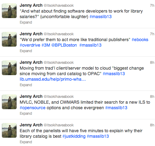
All library systems experienced some growing pains during the change; in some cases, initial training was good, but follow-up training could have been better. “The old system never looks as good as when you’ve migrated to a new system,” one speaker said somewhat ruefully. “It’s always going to be harder than you think,” said the MVLC representative. However, when asked how they felt three months after migrating to the new system, overall everyone seemed satisfied with their new ILSs, though each had a laundry list of wishes, and much of the reporting seemed based on anecdotal evidence rather than formal evaluation of either staff or patron experiences.

ILStweets2
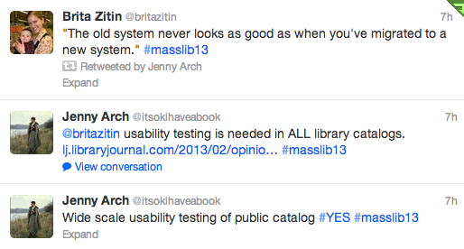
Every ILS has usability issues, and usability testing with patrons would likely identify areas in need of improvement for each ILS; developers don’t always develop with real users in mind. (As Aaron Schmidt pointed out in Library Journal, most library catalogs are designed to prioritize the collection, not the people searching the catalog.)

The last session I attended on Wednesday was “Loaning eReaders to the Public: Legal and Strategic Challenges,” where Anne Silvers Lee and Jamie Wilson from the Free Library of Philadelphia and Melissa Andrews from the Boston Public Library spoke about the lessons they learned in the process of developing programs to circulate e-reading devices: the Free Library lent B&N nooks, and the BPL will be lending iPad minis starting next month.

This was a fascinating session that started off with some startling statistics. E-readers, Ann said, are “not a cutting-edge thing anymore”; forty percent of libraries loan e-readers. Why did the Free Library want to lend e-readers? They considered the digital divide (the gap between those who are familiar with technology and those who don’t use it; in Philly, 41% of the population of 1.5 million does not have internet access at home), patron demand, innovation, and transliteracy.

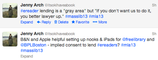
The library obtained a grant to purchase e-readers and hire part-time staff to help train patrons on how to use the devices. They chose nooks because B&N offers institutional accounts for invoicing and batch wifi delivery of new content; they were also aware that Amazon had already sent out at least one cease-and-desist letter for lending Kindles. Jamie referenced copyright experts Mary Minow and Peter Hirtle of LibraryLaw.com and Cornell University, respectively, whose opinions the Free Library sought to determine the legality of their lending program. He summed up their response as “We’ve looked into this, we think it’s all right,” with Hirtle less sure than Minow (who also included a long list of caveats).

ereaders1

During the Q&A at the end of the session, I suggested that B&N and Apple’s cooperation in helping the libraries set up their devices for lending implied consent, but apparently it’s still a “gray area.” However, Ann said, “If [device manufacturers] don’t want us to do it, [they] better lawyer up.”

ereaders2Jamie explained the Free Library’s system for lending: the program was limited to patrons fifty years of age or older, all of whom had to have a library card and a valid ID. There were steep late fees in place (though fears that the devices would be stolen proved unfounded; none went missing), and all users had to take a training class. All of the nooks circulated from the senior center in the Main Branch, and all were pre-loaded with the same selection of fiction and nonfiction bestsellers and classics. Because they weren’t buying content through a third-party vendor like OverDrive or 3M, they could purchase titles from all “Big 6” publishers.

Results once the program launched were somewhat disappointing, with lower use of the devices than they had anticipated. In response, the library lowered the age requirement for borrowing, expanded the availability to other locations, dropped the training requirement (while providing even more training classes), and eventually repurposed some of the nooks for staff training.
ereaders3

Then, of course, there was the lawsuit: the National Federation for the Blind sued the library because the nooks were not accessible. The lawsuit was resolved, but it stands as a cautionary tale, and the BPL accordingly proceeded with caution when planning their own e-reader lending program. The NFB had sent a letter to the mayor of Boston stating that it was an ADA violation to lend nooks or Kindles; only iPads were appropriately accessible (more than just text-to-speech capability is required for a device to be considered accessible).

The BPL purchased 70 iPad minis with a grant, and worked with Apple to ensure that users’ personal data was protected and that any content a user had added to the device was wiped between checkouts. The iPads are preloaded with 40 high interest titles as well as some apps; they will circulate for two weeks at a time, and patrons will be able to place holds on them through the catalog (though Melissa anticipates long wait times due to their popularity). The iPads will show up in the results list when patrons search the catalog for books that have been preloaded onto the iPads; this is something that the Free Library staff thinks would have boosted circulation of their devices, which only appeared in the catalog if you searched for them by device name.

Overall, this was an informative session. All three speakers were well prepared and articulate, and the learning curve was evident in the changes that the Free Library made to its own lending program as well as how the BPL developed its lending program. As I’ve said before, libraries are all about sharing, and learning from each other’s experiences is one way of doing that. For any library that is considering implementing an e-reader lending program, I’d definitely recommend consulting these folks’ resources.

Next: the Thursday sessions at MLA were also fantastic. Stay tuned for not-so-concise summaries of four more sessions (probably in two parts, probably tomorrow or early next week). The Twitter hashtag war continues, so make sure to check #mla13 and #masslib13 (I was mostly using the latter).

Goodreads shelves

[Note: if you don’t use Goodreads, and never plan to, there is zero need to read this post. Scroll down to read about Banned Books Week, The Perks of Being A Wallflower, and other things instead.]

I’ve been using Goodreads, a social networking site for readers, since 2007. I started using it as a way to keep track of books I’d read, as well as to keep an actual (as opposed to mental) “to-read” list. I’m still using it that way, and now I have a personal database with five years of data that I can consult anytime someone needs a recommendation.

Not only can I sort books by self-created categories (“shelves”), such as young adult, mystery, history, or science, I can also look back on my own ratings and reviews, and see friends’ reviews as well. Friends’ reviews count for a lot: research has shown that a recommendation from a friend is likely to be more influential than a professional review, a bookstore or library display, or an auto-generated Amazon suggestion.

Overall, Goodreads’ usability and user experience (how easy and how pleasant it is to use the site) are pretty top-notch. The only problems I’ve ever had are (1) when the site is getting too much traffic and I’m not able to access it for a few minutes; this message is accompanied by an elegant line drawing of a woman sitting in a chair reading a book, and (2) creating a fourth permanent shelf for “partially-read” books, in addition to the three automatic shelves: read, currently-reading, and to-read.

This is such a small thing, but I’ve had conversations with other Goodreads users, and it’s come up for most of us. Though a book can be on as many of your self-created shelves as you want, it must also be on one – and only one – of the three original shelves. But what if a book is neither read, currently-reading, or to-read? What if you read the first few chapters and put it down, never to return? (There’s no guilt in that.) Many people have created shelves for these books, such as “partially-read,” “abandoned,” or “unfinished,” but the book still had to be on one of the original three.

This is no longer the case, I’m glad to report. I wrote to Goodreads about it, and a Customer Care Representative got back to me overnight to inform me that I could make my partially-read shelf “exclusive” by going to the Edit Shelves page and checking a box. Which I did. And it worked. I’m not sure how long that’s been an option – it wasn’t in 2007, I don’t think, but I could be wrong – but it is now.

So, big points to Goodreads for creating a great site and being responsive to its users. This is how it’s done.

Recommended Recommenders

A recent blog post on the Boston Globe site highlights seven “book recommendation websites” people can turn to for reading suggestions. I was already familiar with four of the seven, but decided to explore the rest for comparison’s sake. If I’ve made a mistake, feel free to correct me in the comments; conversely, if you are a devoted member of one of these sites and want to sing its praises, please feel free to do that as well!

Goodreads
This is a site I use every day; I’ve been a member since 2007, and have over a thousand books on my “shelves.” Goodreads offers a great way to keep track of what you’ve read (including when you read it, what you thought about it, your rating – out of five stars – and who recommended it to you), what you’re currently reading, and what’s on your to-read list for the future. You can create more shelves in addition to these three – historical fiction, for example, or biography – and you can see what your friends have read. Goodreads will recommend books for you based on your shelves, and you can see others’ lists, take quizzes, and sign up for giveaways. There are also many “Goodreads authors,” published authors who participate as members. One of my favorite features of the site is that it combines personal recommendations with crowd-sourced ones, so I can see what my friends thought of a book as well as what everyone else of Goodreads thought of it. Great usability, too – the interface is pleasant and intuitive, you can sort your lists by author, title, date read, date added, rating, etc., and you can get some nice descriptive statistics too.

LibraryThing
LT is similar to Goodreads in many ways: you can create your own shelves and tags, see your friends’ books, create a profile, get recommendations, and participate in giveaways. LT offers richer metadata, including Dewey Decimal Classification and Library of Congress Classification (DDC and LCC). The interface isn’t quite as user-friendly, but it’s a robust site, and if Goodreads didn’t exist, I’d happily use LT as my primary books-and-reading website.

Shelfari
Shelfari is powered by Amazon, which means two things: (1) it is designed to get you to buy books, preferably from Amazon, and (2) the design is beautiful and the user experience (UX) is fantastic. I remember an earlier version of the site, which was kind of clunky – maybe why I chose Goodreads instead of Shelfari five years ago – but it’s clean and colorful now. Shelfari rates high on content and interactivity; like Goodreads and LibraryThing, it’s a social networking site for readers (or in their words, “a community-powered encyclopedia for book lovers”). The front page pushes books that are already popular, including New York Times bestsellers and Amazon bestsellers, but if you dig deeper into the site, you can narrow by category or subject. One of the most useful features I discovered was the Series tab, where you can see all the books in an author’s series, in the correct order – definitely helpful at the reference desk.

Whichbook
I’ve already written about Whichbook; I like it very much. It isn’t nearly as robust as Goodreads, LT, or Shelfari, but it isn’t meant to be; it’s less a social networking site for bookworms and more of a reader’s advisory site. It’s whimsical, with its sliding scales (optimistic to bleak, funny to serious, safe to disturbing) instead of a traditional search box, and it does a good job suggesting off-the-beaten-path books rather than the most popular books. There are lists as well, in categories such as “Bad Luck and Trouble” and “Weird and Wonderful,” and you can also create your own lists. Whichbook promotes libraries over Amazon: the “borrow” button is ahead of the “buy” button.

What Should I Read Next?
WSIRN, as it’s called, is one of the most basic sites in this collection. You can create two lists: like and dislike. You can get recommendations based on any title on your list; however, these recommendations are based “purely on collective taste.” That is, books on the same list become associated with each other. This might work fine if everyone liked only one genre, so all mysteries were associated with each other, all romances associated with each other, etc., or if users were able to create and name multiple lists (e.g. “favorite biographies”), but that’s not the case. I have read and loved many books that were wildly different from each other, and the only thing they had in common was that I liked them; I wouldn’t necessarily recommend them both to the same person. That said, WSIRN is a simple, quick tool, and the developers may add functionalities in the future.

The Staff Recommends
The Staff Recommends is, as far as I can tell, McSweeney’s editor-at-large John Warner. (Supposedly also his “team of readers,” but all the reviews I read on the site were written by John.) TSR calls itself “an advertorial publication,” meaning they do get paid for recommending books, but they only recommend books they like; furthermore, proceeds are donated to a nonprofit, so I feel confident that the recommendations are honest. So, if you happen to have the same taste as John and his “team of readers,” you’re in luck! Whether you agree with him or not, the reviews are thoughtful and well-written. As of today, there are eight current selections and a few lists (e.g. crime novels) consisting of shorter reviews of more titles. TSR offers fewer points of view and less content than most of the other sites in the article, but it’s worth bookmarking nonetheless.

Gnooks
The main appeal of this site is the “literature map” that it creates when you type in the name of an author. However, there’s no information as to how the relationships between authors are determined. I want to know why Author A and Author B are considered similar: is it the subjects they write about? Their writing style? Hard to say. You can also get recommendations based on authors you like (I tried it; results were pretty accurate, but there were only three). I probably won’t use this regularly, but I do like that it’s author-centric rather than book-centric.

Decisions, Making

Two seemingly unrelated bits of news/opinion in this post, but both have to do with decision-making on some level. To start, one of the first articles I read this morning was Ann Patchett’s op-ed in the New York Times about the Pulitzer Prize Board’s failure to select a fiction winner from the three finalists. As Patchett points out, this is not only disappointing for the authors (“It’s fine to lose to someone, and galling to lose to no one”), it’s also a letdown for readers and for booksellers. Here are the past winners.

Another article I read today is from ASIS&T: Thom Haller wrote on the topic “What happens when architectural questions are not asked?” (architecture, here, is information architecture, or IA). He used Facebook as an example, and it’s a good one: who hasn’t been confused by Facebook’s changing structure, or its hierarchy and organizing principles (or lack thereof), not to mention its always-in-flux privacy policies? The problem Haller discussed was that of labels (or lack of labels) for “content clusters,” and it’s something that would probably come up in a basic usability test; right now, it’s not really clear what the difference between “public” and “all” is, unless there is a label for each group of options (there isn’t).

For such a huge site, there are some surprising difficulties in terms of navigation and settings. I almost have to assume that these difficulties are planned, or at least unresolved, on purpose; it seems like Facebook wants certain actions (privacy settings, unfriending) to be difficult.

So as not to end on a negative note, please enjoy this list of fake Massachusetts town names from McSweeney’s. And may I also recommend Jenny Lawson’s (a.k.a. The Bloggess) just-published memoir, Let’s Pretend This Never Happened? Read a snippet here. (Unless you’re at work, because most people’s work doesn’t usually provoke hysterical laughter, and this might. You’ve been warned.)

MLS

After yesterday afternoon’s half-hour group presentation in class (LIS 531Y, Usability and User Experience Research) on our team’s usability study on the EBSCO Discovery Service (EDS), and last night’s condensed presentation on the same to the Usability Professionals Association (UPA) Boston Chapter, I am completely done with papers and presentations (and all other work) for my MLS degree. HURRAY!

Photos: one group member from each EBSCO team presented the results of the usability tests to the UPA Boston meeting on at Simmons College on December 12.

As it happens, a recent (December 7) Library Journal article included comparisons of four discovery services, the first of which was EDS. Amanda Clay Powers of the Mississippi State University Libraries observed that EDS worked especially well for undergraduates (novice) and for doctoral students and faculty (advanced), but less well for upper-level undergraduates and master’s students, who were still best served by subject-specific databases.

The research we did in Usability and User Experience Research this semester was focused less on content and more on usability and specific system features (such as the cite tool, the “find similar books” option, and the ability to save or share search results). Still, the LJ article was an interesting overview, especially as it compared multiple discovery interfaces.

One Week

One week of classes left! I have been busy recently with final projects and papers (some parts of which I may post here in the future), but the end is in sight. Meanwhile, a few articles on usability, user experience, and design:

UX Hierarchy of Needs – The author proposes that there is a “UX hierarchy of needs,” namely (from the bottom up) Functionality, Information, Aesthetics, and Usability. The first two are the basic needs, the latter two are the higher needs. However, I’m inclined to switch usability and aesthetics – as a user, I’d rather a system be easy to use than pretty to look at (although aesthetics is more than just “prettiness” – it also encompasses branding).

9 Rules to Make Your Icons Clear and Intuitive – Much more thought and planning goes into (or should go into) those tiny buttons than you might think. This article (same author and site, UXMovement, as above) covers some good basic rules-of-thumb, such as labeling icons, grouping similar icons, and keeping icon order and placement consistent. However, some established icons that break one or more of these rules still work well because so many people know what to look for – the chain link representing the hyperlink, for example, or the ABC for strikethrough. (The author recommends a blue underlined L for the first, and a struck-through S instead of ABC for the latter.)

14 Guidelines for Web Site Tabs Usability – Many sites use tabs for navigation; they are good real-world metaphors (most people are familiar with filing cabinets or binders), they improve content organization, and they are “visually pleasing.” The author outlines some guidelines, illustrating many of his points with appropriate screenshots (remember when Amazon used tabs?). Among these guidelines: tab labels should be 1-2 words, in plain language; tags should be organized in an order that makes sense to users, and related tags can be grouped; and the active and inactive tabs should be clearly indicated so the user can tell what section of the website they are currently in.