God’s Hotel by Victoria Sweet: More of a memoir than I realized – not a bad thing – but centered around the idea of “slow medicine.” The author makes a good case for allowing doctors enough time with their patients; a correct diagnosis can save a lot of money in the long run, which insurance companies would be smart to recognize.
Kitchen Confidential by Anthony Bourdain: Also a memoir, one that takes the reader behind the scenes in restaurant kitchens. Bourdain is a writer with a great voice, and he’s got some tips readers would be wise to heed as well, in terms of dining out.
The Art of Fielding by Chad Harbach: This novel came highly recommended by at least two friends, and while it didn’t send me out into the streets to press copies into strangers’ hands, I did enjoy it. It was more of an ensemble cast than I first thought it would be, and each character is equally well-rounded, from baseball star Henry, to workhorse coach/player Mike, to lovestruck college president Guert Affenlight, to his daughter Pella who has fled a bad starter marriage.
Invisibility by Andrea Cremer and David Levithan: I adore David Levithan and a friend sent me a galley of Invisibility before it was published; by all rights I should have read it right then, but I didn’t. Like Levithan’s Every Day, Invisibility has a unique premise: Stephen is invisible, due to a curse from his grandfather. No one, including his parents, has ever been able to see him – until Elizabeth moves in to his apartment building. The two of them fall in love, and together – along with Elizabeth’s brother Laurie – try to break the curse. Chapters alternate between Stephen’s and Elizabeth’s perspectives.
Wild Girls by Mary Stewart Atwell: A friend at the publisher sent me a copy of this just before it came out, but I didn’t get around to it till I chose it for my book club for January. In a small Appalachian town, teenage narrator Kate dreams of getting out, and fears turning into one of the “wild girls” who go on dangerous rampages. Though the author made the connection between the powerlessness of girls and their rage, I felt that she could have delved more deeply into this issue. However, it was still an enjoyable read, with a great sense of place.
Aside from my official TBR list, I’ve also finally read a few books that have been on my unofficial TBR list for a long time, including Steve Krug’s Don’t Make Me Think, a galley of My Sunshine Away that I got at BEA last May, Breasts: A Natural and Unnatural History by Florence Williams, The Miseducation of Cameron Post by Emily Danforth (recommended to me by at least two colleagues), Howards End (which has been sitting on my shelf for years), and This Wheel’s On Fire by Levon Helm. All of these were good, though the standouts were the nonfiction titles, specifically Breasts and Don’t Make Me Think. (The joke there just writes itself.)
Are you participating in a TBR challenge, officially or unofficially? Which books have made you say “Why didn’t I read this sooner?!” and which ones weren’t quite worth the time?
I first heard about Don’t Make Me Think! by Steve Krug in grad school, but as William Goldman wrote in The Princess Bride, “What with one thing and another, three years passed.” (Actually, it may even have been four years; long enough, anyway, for a new edition to be published, so you see, every now and then procrastination pays off.)
That said, I highly recommend you make this book the next one you read. Don’t Make Me Think! is about usability, and specifically about usability as it pertains to websites (and now mobile sites and apps as well). While usability has many attributes – a website may be useful, learnable, memorable, effective, efficient, desirable, delightful – Krug’s definition of usability is as follows:
“A person of average (or even below average) ability and experience can figure out how to use the thing to accomplish something without it being more trouble than it’s worth.”
Krug’s writing is accessible, clear, funny, and peppered with relevant examples and illustrations; he cites many sources, including Jakob Nielsen, Don Norman (author of the excellent The Design of Everyday Things), and Ginny Redish (author of Letting Go of the Words). He explodes the myth of “the average user” (“All web users are unique and all web use is basically idiosyncratic”) and shows the value of usability testing as a way forward when designers and developers don’t agree. Krug writes, “Usability testing tends to defuse most arguments and break impasses by moving the discussion away from the realm of what’s right or wrong and what people like or dislike and into the realm of what works or doesn’t work. And by opening our eyes to just how varied users’ motivations, perceptions, and responses are, testing makes it hard to keep thinking that all users are like us.”
In addition to explaining why usability is important, Krug suggests some specific guidelines. For example, format text on your site to support scanning by:
using plenty of headings
keeping paragraphs short
using bulleted lists
highlighting key terms
Krug highlights the importance of site navigation, which, as he sees it, has three important functions:
It tells us what’s here (“Navigation reveals content!”)
It tells us how to use the site
It gives us (the user) confidence in the people who built [the site]
Krug also advises using clear language – no specialized jargon or cutesy labels – and making the information you know people will be looking for, like contact information, available in a logical place. Ultimately, “Usability is about serving people better by building better products.”
The first I heard of therapy dogs in libraries was through the Library Link of the Day in July 2012, which was a short article (“Therapy Dog Helps Children Learn“) about a retired racing greyhound who visited libraries, nursing homes, and rehab centers. I sent it to a co-worker, who asked if I knew that “Lucy the READ dog” was visiting our main library and branch that very week? I had not known.
It turns out that dogs visiting libraries in order for kids to read to them or otherwise interact with them is becoming more and more common. Earlier in 2012, Library Journal posted a piece called “Therapy Dogs’ Presence Steadily Grows in Libraries.” Meredith Schwartz wrote about a public library in Wisconsin that welcomed Reading Education Assistance Dogs (READ); children participated in the “Read to a Dog” program to improve their literacy skills. A study at Tufts University showed that reading to dogs helped kids improve more than reading to humans. Colleges and universities have also begun bringing dogs in during finals week to help students de-stress by spending time with animals.
In a public library in Ohio, the Tail Waggin’ Tutors (handler/dog teams from Therapy Dogs International) visit the library once a month. The dogs are non-judgmental listeners, who are able to give children an un-intimidating environment for reading practice. They don’t interrupt or correct, and some of them are even happy to cuddle. (“Therapy Dogs Help Give Kids Reading Confidence,” 11/2014).
Research is beginning to show that “Psychological effects of pets are profound” (Boston Globe, 1/2015). Sy Montgomery wrote, “pet-assisted therapies help troubled children, people with autism, and those suffering from Post Traumatic Stress Disorder and drug addiction. Pets help normalize brain chemistry.”
Service dogs are even sometimes used in schools to identify and help stressed-out students (“Stressed? This Dog May Help,” New York Times, 10/2014), though service dogs are in a different category than therapy dogs; they’re trained more extensively and covered under the A.D.A.
Sudo (and her new friend Daisy) with her official Dog B.O.N.E.S. bandanna at the end of the third class.
Here in Massachusetts, there’s an organization called Dog B.O.N.E.S. (Dogs Building Opportunities for Nurturing and Emotional Support) that trains volunteer handler/dog teams and helps organize visits to schools, libraries, nursing homes, assisted living facilities, hospitals, colleges and universities, and other organizations that request a team. This winter, despite the frequent blizzards, my husband and I and our greyhound, Sudo, completed a three-session training course with Dog B.O.N.E.S. Unfortunately, Sudo is a little skittish with children and wouldn’t be a good “read dog” for younger kids, but I hope that some of our classmates, instructors, or other Dog B.O.N.E.S. volunteers can visit our library this year. Meanwhile, we’ll look for opportunities to bring her to visit adults who might enjoy the soothing company of a calm, friendly dog.
Massachusetts libraries interested in having a team from Dog B.O.N.E.S. visit should contact the organization through the e-mail address on their website. Dog B.O.N.E.S. teams are insured in Massachusetts.
Once a year or so, my husband and I order several one-ounce packets of various kinds of tea from a site called Culinary Teas. This year, when our supplies dwindled and we went to place a new order, we were completely blown away at the site’s new design. We could not stop marveling at it.
Thanks to the Internet Archive’s Wayback Machine, it’s still possible to see what the Culinary Teas site looked like before. Here’s a screenshot from February 10, 2011:
The Culinary Teas site, as captured by the Wayback Machine in 2011.
Again, thanks to the Wayback Machine, I could see that the site design really hadn’t changed much from its beginnings in the early 2000s. Here’s what it looked like in 2003:
The Culinary Teas site in 2003, courtesy of the Wayback Machine.
They changed some colors around – the orange disappeared between 2003 and 2008 – but the site ID is still the same, and you can see they’ve got a seasonal theme going on behind it (snowflakes, leaves). There is a lot of text, and left and right sidebars, and the overall effect is busy, if functional; the login option and shopping cart are roughly where you’d expect them to be, near the top right, and the left sidebar provides an easy way to browse different kinds of tea. The search box is buried on the lower part of the right sidebar, which is not where most users are accustomed to looking for it, but if you’re just here to buy different teas, the left sidebar organization is pretty clear. Overall, the design of the site is functional; it works, it’s just not necessarily a pleasure to use.
HOLY SHIT IT’S BEAUTIFUL. Partly our reaction was due to the difference between our expectation (we remembered the old site) and the reality (of the new site). First of all, there’s a ton of white space, and much less text, so the first impression is much cleaner. The teapot logo is transformed and the site ID font is updated; they’re arranged together in the top left, according to standard web conventions, instead of top center. And there in the top right is the search bar, again in line with conventions; My Account is there too.
As for navigation, the left sidebar menu has remained more or less unchanged in terms of content and organization, and the organization makes sense to me (both as a tea-drinker and as an organization-minded librarian). The horizontal nav across the top, under the search box and My Account link, offers a reasonable six choices. (There are additional footer links, but we never needed to use them; even the About and Contact links, which are often buried in the footer of commercial sites, are header links here.)
When you click on one of the left nav options – Organic Teas, say – the resulting display is jaw-droppingly gorgeous:
Visual image of tea, name of tea, starting price for smallest amount. Beautiful.
Talk about “what you see is what you get.”
Culinary Teas has had a good product for a long time, and now they have a great website to showcase it as well. As Steve Krug writes in Don’t Make Me Think! (more on this soon), “Delight is a bit hard to pin down; it’s more one of those ‘I’ll know it when I feel it’ kind of things.” Other attributes of usability are more important: is it useful, learnable, memorable, effective, efficient, desirable? The previous version of this site had most of these usability attributes – I don’t ever remember being frustrated while using it – but it wasn’t delightful. The new version is. Three cheers for good design!
I first heard about Finnish Lessons: What Can the World Learn from Educational Change in Finland? by Pasi Sahlberg from the review “Schools We Can Envy” by Diane Ravitch in the New York Review of Books (3/8/12), but I didn’t pick it until December 2014. Reading Finnish Lessons was an enlightening experience, and a frustrating one. Enlightening, because Sahlberg shows how Finland developed a shared philosophy, set a goal, and achieved that goal by using evidence-based research; frustrating because the U.S. and many other countries are taking an opposite approach, despite evidence that this approach – competition between schools instead of cooperation, an increase in standardized testing – has been shown not to work.
Underpinning Finland’s steady educational improvement since the 1970s is a set of shared philosophies:
All pupils can learn if they are given proper opportunities and support.
Understanding of and learning through human diversity is an important educational goal.
Schools should function as small-scale democracies.
The role of public education must to be educate critical and independent-thinking citizens.
The basis of Finland’s education policy is that instruction is the key element that makes a difference in what students learn in school – not standards, assessment, or alternative instructional programs. To that end, teacher education was overhauled, so that now all teachers in Finland have master’s degrees, and all principals are or have been teachers. Teachers are trusted in society, and have autonomy within their classrooms. This approach has been successful; Sahlberg writes, “What PISA surveys, in general, have revealed is that education policies that are based on the idea of equal educational opportunities and that have brought teachers to the core of educational change have positively impacted the quality of learning outcomes.”
The Finns value equity in education, “a principle that aims at guaranteeing high quality education for all in different places and circumstances.” In practice, this means that Finnish students, no matter where in the country they live, receive an equally high level of instruction and support. And within schools, “ability grouping” (also called tracking or streaming) was stopped in 1985. Instead, teachers pay attention to students who have special educational needs; Sahlberg writes, “The basic idea is that with early recognition of learning difficulties and social and behavioral problems, appropriate professional support can be provided to individuals as early as possible.” So many students receive help at one point or another during their time in school that special education is not stigmatized the way it sometimes is in the U.S. And, as in medicine, an ounce of prevention is worth a pound of cure.
As I was writing this post, the Library Link of the Day featured the Washington Post article “Requiring kindergarteners to read – as Common Core does – may harm some” by Valerie Strauss (1/13/15). Strauss quotes from the report “Reading in Kindergarten: Little to Gain and Much to Lose” by Nancy Carlsson-Paige, Geralyn Bywater McLaughlin, and Joan Wolfsheimer Almon: “Many children are not developmentally ready to read in kindergarten. In addition, the pressure of implementing the standards leads many kindergarten teachers to resort to inappropriate didactic methods combined with frequent testing. Teacher-led instruction in kindergartens has almost entirely replaced the active, play-based, experiential learning that we know children need from decades of research in cognitive and developmental psychology and neuroscience” (emphasis mine). Why on earth are we developing new standards in the U.S. that aren’t research-based? Why are we, in fact, doing the opposite of what the research indicates we should do? Incidentally, in Finland, school doesn’t start till age 7 – but of course, there are free, high-quality preschools that most children attend before then. (Universal preschool, let alone daycare, being another thing we don’t have here.)
It’s true that Finland is a very different country from the U.S.: it has a smaller, more homogenous population, a better social safety net for its citizens (only 4% of children in Finland live below the poverty line, compared to 20% in the U.S.). Sahlberg addresses those differences in his book, but it doesn’t change the main message, which he states in the introduction: “There is another way to improve education systems. This includes improving the teaching force, limiting student testing to a necessary minimum, placing responsibility and trust before accountability, and handing over school- and district-level leadership to education professionals.” In this country, we’re moving in the exact opposite direction, in spite of the fact that these strategies – teaching a prescribed curriculum, increasing standardized testing, relying on tests to measure accountability – haven’t worked in the past.
Thinking back to my own education, I know Sahlberg is right when he says “instruction is the key element.” What I remember best are my teachers: their enthusiasm, creativity, and dedication. The projects they came up with, the inventive paper topics they assigned, all of the resources they included beyond textbooks: novels and paintings and primary source documents. I remember their handwritten feedback on papers and tests, and the learning that occurred because of those comments. When you take a standardized test, no one goes over it with you afterward; you don’t know what you got right or where you made a mistake, so you can’t learn from it, you can only be anxious, or forget the experience. Students must be able to learn from their mistakes and failures; if failure only brings punishment instead of a learning opportunity, the fear of failure will become so great that students will stop trying anything creative or challenging, and their learning will become a smaller, more circumscribed thing. Are those the kind of citizens we want to produce? I don’t think so. I hope not.
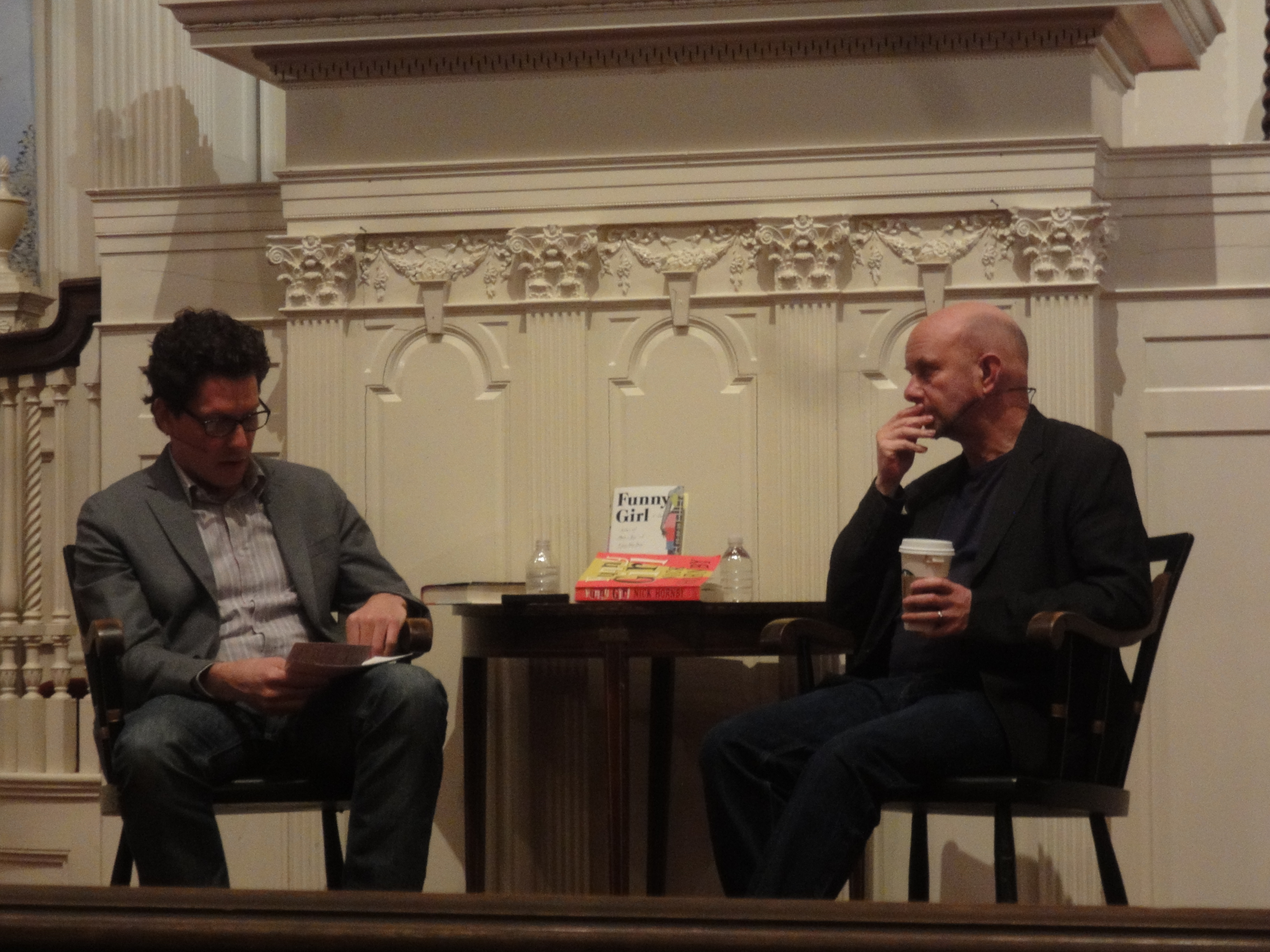
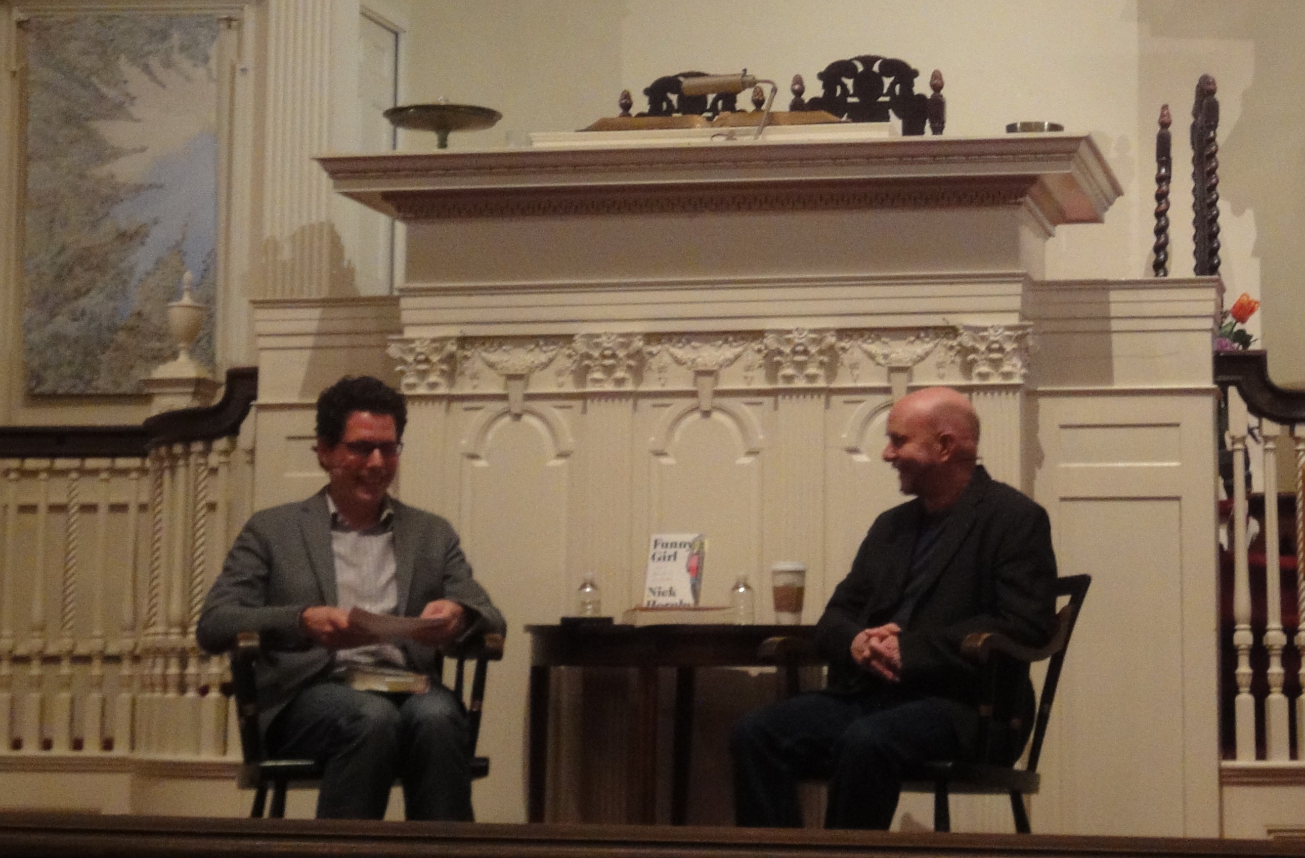
Despite being wildly excited for a new Hornby novel, and having read Funny Girl in galleys, I would have missed this event completely if it weren’t for my husband, who (a) discovered it was happening, and (b) called to get us tickets about three hours before the event started (after a brief, “oh no, Nick Hornby is in town tonight but it’s sold out!” panic). Usually I detest surprises of any kind, but it turns out that “Nick Hornby’s doing a reading and book signing tonight and we have tickets” is in the good surprises category.
Harvard Book Store event: Ethan Gilsdorf and Nick Hornby at the First Parish Church in Cambridge
Hornby appeared in conversation with Ethan Gilsdorf at the First Parish Church in Cambridge in an event organized by the Harvard Book Store. Serena, the book store employee who introduced him, said that his new novel Funny Girl achieved the “Nick Hornby trifecta”: smart, funny, and a little bit sad. This was the first stop on the U.S. tour, so there was the obligatory joke about snow, and didn’t he wish he’d started in California and worked in the other direction? (Snow didn’t stop fans from attending; it was a pretty full house.)
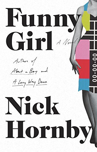
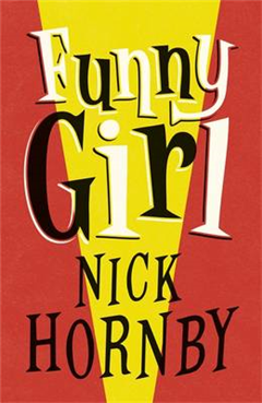
The U.S. cover of Funny Girl.
Gilsdorf asked Hornby what intrigued him about the time period and setting (London in the 1960s), and Hornby answered that his interest was born out of his work on An Education, which ended in 1963, and a conversation he’d had with actress Rosamund Pike. “Beautiful women are not often allowed to be comediennes,” Hornby realized, and thus the fictional British Lucille Ball – the main character of Funny Girl – was born. He also wanted to write about “the joy of collaborative work…the joy of conversation about lines in movies.” Hornby said, “All this fierce intelligence goes into popular entertainment,” and that statement more than any other might best sum up Funny Girl, whose characters believe at their cores in the value of comedy.
Did Hornby think of Funny Girl as historical fiction, a sort of alternate reality? He worked backward from the ending, a coda in which all the characters are in their 70s, looking back on their careers. If that was in the present, then their early careers would have been around 1964, ’65 – where An Education ended. The 1960s “was a really fantastic time for television…if you had a hit show then, everybody watched it.” Funny Girl, Hornby said, is more about the birth, life, and death of a hit show than about any one character; having read the book, I have to agree. Sophie herself admits, “It was always about the work. She’d never been in love with Clive, but she’d been in love with the show since the very first day.”
Funny Girl includes images of ephemera along with the text: real photos from the time, mock scripts from the TV show in the book – called Barbara (and Jim) – and other bits and pieces. “Why don’t novels have photographs? Why shouldn’t they?” Hornby asked. He even included a cover for one of his character’s books, which a designer at Penguin created.
The U.K. cover of Funny Girl.
Though the book is mostly about Sophie – the eponymous funny girl – Hornby chose to read a section about her co-star, Clive. He read from the U.K. edition, and bent the cover back in a way that was almost physically painful to see (my husband saw the expression on my face and wondered if Hornby was bleeding. No, I said, the book is hurting). After reading, he talked again about Lucille Ball. “We didn’t have anything like that” in England…”Monty Python was so male.” He enjoyed creating an alternate history, giving England a comedienne. “I’ve done my bit,” he said, getting a laugh from the audience.
Next, Hornby and Gilsdorf talked about Hornby’s screen adaptation of Cheryl Strayed’s memoir Wild. Some people had expressed doubts about a man writing the screenplay, and Hornby admitted he was neither a hiker nor a woman. (Never mind that men have been writing female characters, and vice versa, for centuries.) But “it’s a book about being unable to hike…written with a liberal arts sensibility.” Furthermore, “it was a memoir, there [on the page] was the woman’s head!” In the book, Strayed reveals much in the first chapter, but Hornby decided to make it “an emotional mystery” so viewers “see the damage this grief has caused.”
Gilsdorf asked about the romanticized life of the writer, referencing a section of Hornby’s website, “An Average Day.” Hornby’s advice to writers is, first, “if you can stop [writing], stop,” and second, “if you can write 500 words a day…do the maths…we should all be capable of writing a book a year.” (I’m not a “maths” person, but this is the approach I take in my fiction writing as well; for my first manuscript, I set the bar even lower, at 250 words a day, then bumped it to 500. For my second manuscript, I aimed for 750 words a day. It really does add up.) Hornby mentioned the Freedom app to block the internet, though “it’s ridiculous you have to pay somebody money to stop you doing something you’re paying for…”
The audience questions were a varied lot, including far more questions about football (soccer) than I’ve ever heard at an author event. But the first question concerned not Arsenal but the Spree, Hornby’s name for the editors at The Believer, where he writes his “Stuff I’ve Been Reading” column. Vendela Vida first asked if he would write a music column, but he’d just finished writing about music for The New Yorker and wanted to write about reading instead, “about how one thing leads to another.” (Incidentally, the running joke about the Spree is one of my favorite running jokes in print. Though I’m not sure how many others there are.)
Another audience member asked about Hornby’s collaboration with Ben Folds, about which I knew nothing, and which I will now track down. Someone else asked if he had thought about Barbra Streisand when choosing the title – the working title was Miss Blackpool – and Hornby replied that Funny Girl is “one adjective and one of the most common nouns in existence…I don’t think [Streisand] can copyright it.” Another person asked if Hornby had researched band websites when he was inventing the Tucker Crowe sites in Juliet, Naked; Hornby replied that he’d done no research for the book, but had looked at about 900 band websites for “my own purposes.” With that kind of “intense personal engagement,” he said, “you can only ever disappoint creatively.”
One interesting question was about stumbling blocks in publishing for writers whose first language wasn’t English. “The bar is raised higher,” Hornby admitted, but “so many amazing writers [e.g. Aleksandar Hemon] have written novels not in their first language…The biggest obstacle to being a writer is the job itself, not the language.” Someone else asked what book or author had had the most influence on him; the answer was Anne Tyler, particularly Dinner at the Homesick Restaurant, for her warmth, accessibility, and emotional intelligence. “I can’t be Salman Rushdie” Hornby said (and thank goodness for that), but Anne Tyler showed him there was another kind of book, one he could try to write. The last question was about tone, and whether the sense of humor in Hornby’s books was a conscious addition. “It is self-expression,” Hornby said. “It’s how it comes out.” The difficult part is compressing the parts that are easy to write – dialogue, in his case – so that every scene moves the story forward.
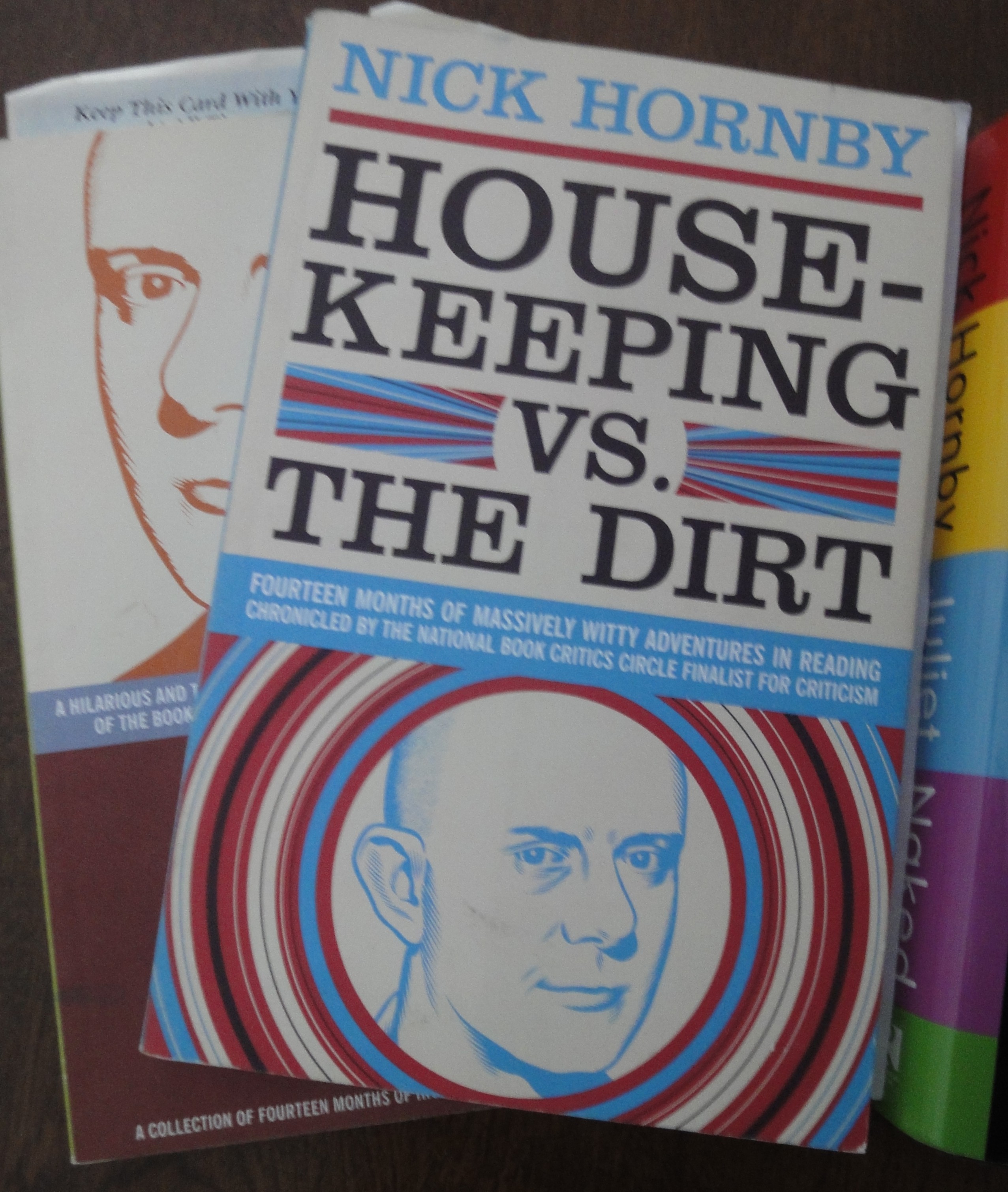
My signed 1995 paperback of High Fidelity.
In my excitement about this event, I only grabbed novels before leaving the house (High Fidelity and Juliet, Naked), forgetting the essays entirely (I’ve got The Polysyllabic Spree and Housekeeping vs. the Dirt, and my friend Josh has Shakespeare Wrote for Money; we bought all three together when McSweeney’s had a deal several years ago). When I reached the front of the signing line, I remembered to compliment the author on the track list for Juliet, Naked, which I’ve admired since I first read it for being able to tell so much story in so few words. (I also said the “top five” thing. Come on, wouldn’t you?)