
Once a year or so, my husband and I order several one-ounce packets of various kinds of tea from a site called Culinary Teas. This year, when our supplies dwindled and we went to place a new order, we were completely blown away at the site’s new design. We could not stop marveling at it.
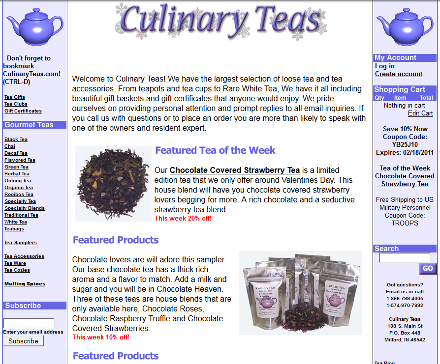
Thanks to the Internet Archive’s Wayback Machine, it’s still possible to see what the Culinary Teas site looked like before. Here’s a screenshot from February 10, 2011:
Again, thanks to the Wayback Machine, I could see that the site design really hadn’t changed much from its beginnings in the early 2000s. Here’s what it looked like in 2003:
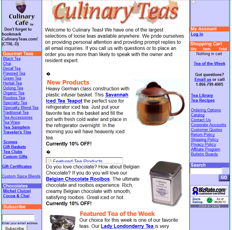
They changed some colors around – the orange disappeared between 2003 and 2008 – but the site ID is still the same, and you can see they’ve got a seasonal theme going on behind it (snowflakes, leaves). There is a lot of text, and left and right sidebars, and the overall effect is busy, if functional; the login option and shopping cart are roughly where you’d expect them to be, near the top right, and the left sidebar provides an easy way to browse different kinds of tea. The search box is buried on the lower part of the right sidebar, which is not where most users are accustomed to looking for it, but if you’re just here to buy different teas, the left sidebar organization is pretty clear. Overall, the design of the site is functional; it works, it’s just not necessarily a pleasure to use.
But then, in 2014…WHAM.
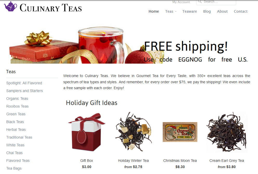
HOLY SHIT IT’S BEAUTIFUL. Partly our reaction was due to the difference between our expectation (we remembered the old site) and the reality (of the new site). First of all, there’s a ton of white space, and much less text, so the first impression is much cleaner. The teapot logo is transformed and the site ID font is updated; they’re arranged together in the top left, according to standard web conventions, instead of top center. And there in the top right is the search bar, again in line with conventions; My Account is there too.
As for navigation, the left sidebar menu has remained more or less unchanged in terms of content and organization, and the organization makes sense to me (both as a tea-drinker and as an organization-minded librarian). The horizontal nav across the top, under the search box and My Account link, offers a reasonable six choices. (There are additional footer links, but we never needed to use them; even the About and Contact links, which are often buried in the footer of commercial sites, are header links here.)
When you click on one of the left nav options – Organic Teas, say – the resulting display is jaw-droppingly gorgeous:
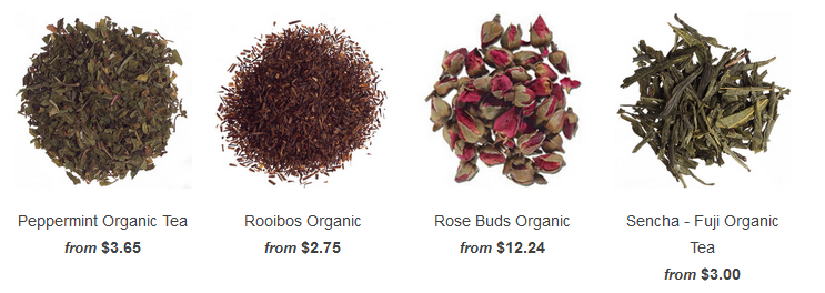
Talk about “what you see is what you get.”
Culinary Teas has had a good product for a long time, and now they have a great website to showcase it as well. As Steve Krug writes in Don’t Make Me Think! (more on this soon), “Delight is a bit hard to pin down; it’s more one of those ‘I’ll know it when I feel it’ kind of things.” Other attributes of usability are more important: is it useful, learnable, memorable, effective, efficient, desirable? The previous version of this site had most of these usability attributes – I don’t ever remember being frustrated while using it – but it wasn’t delightful. The new version is. Three cheers for good design!

[…] blogs a lot about books and authors, education, and technology. Her post on the Culinary Teas website redesign talks a lot about the importance of good design. As librarians and libraries go increasingly […]