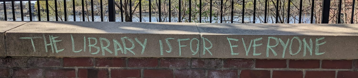
I like organization. I fell hook, line, and sinker for that unlikely de-cluttering bestseller, The Life-Changing Magic of Tidying Up. At home and at work, I appreciate clever storage solutions and neat display ideas. One of the perks of having a library be your workplace is that you can go and look into other workplaces: What sort of shelves do they have? What kinds of signs and wayfinding tools? What do their websites look like, and how well do they work? What services and tools do they highlight – programs, readers’ advisory, e-books? Is there a lot of natural light? Does the artificial light make sense? How many back issues of magazines do they keep, and how do they store them? The questions go on, and most have observable answers. Even better, libraries are a sharing culture: you like how we do X? Go ahead and borrow it!
The Flexibility in Library Design session at MLA this year was one of my favorite sessions at that or any conference. (Presentation slides can be found in the MBLC Resource Guides Collection.) Some ideas in that presentation required rebuilding from the ground up, or major renovations, or otherwise big expenses which, in the world of public libraries, require much advance planning and advocacy. Other ideas are so simple, easy, and low-cost that they could be done in a day.
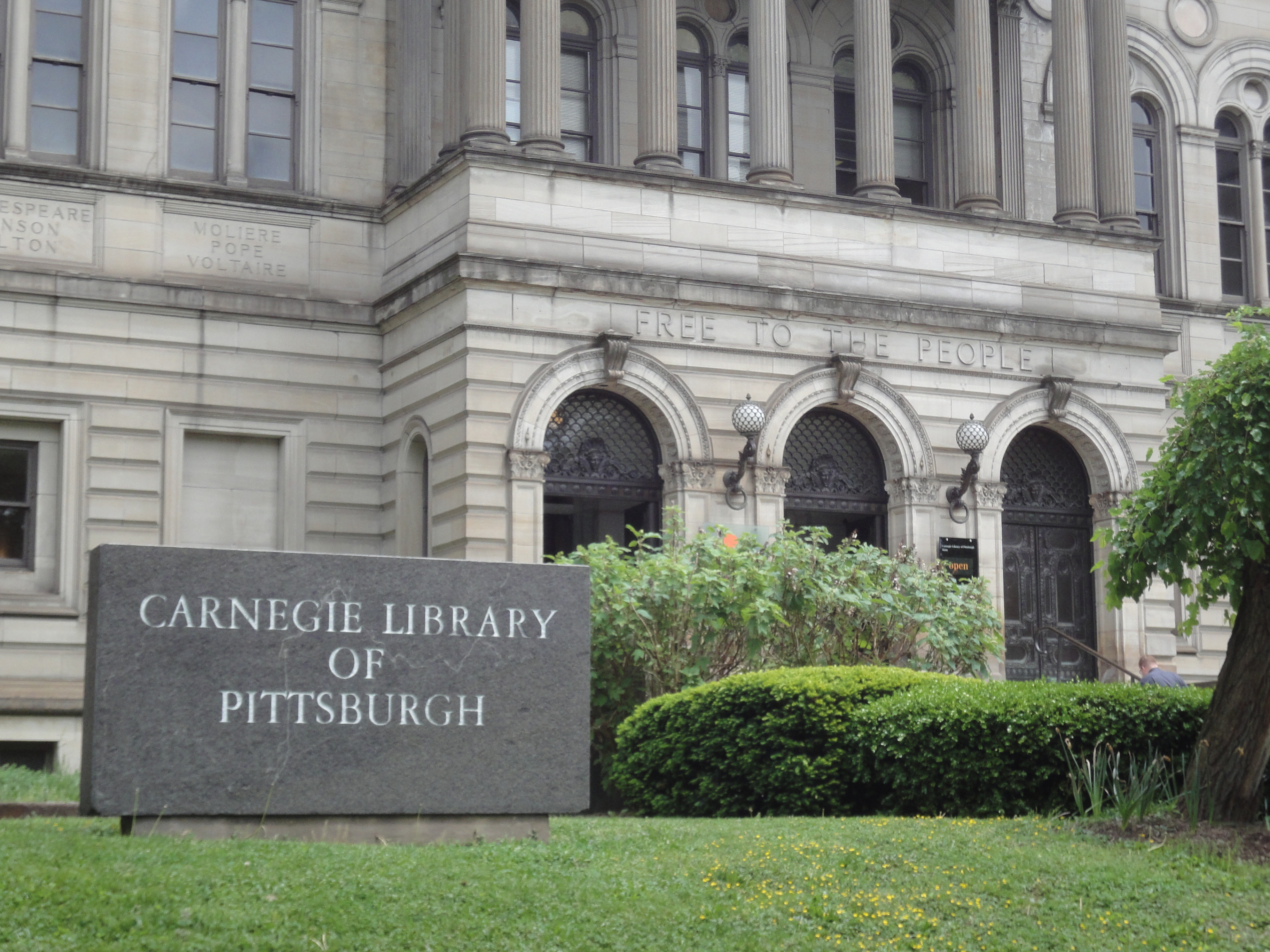 This presentation was still relatively fresh in my mind when I took a trip to Pittsburgh and visited the Carnegie Library of Pittsburgh (the main library) and the Squirrel Hill branch library. I admired both libraries’ welcoming atmosphere, and how they had incorporated their history into their new designs (the Squirrel Hill branch was renovated in 2005).
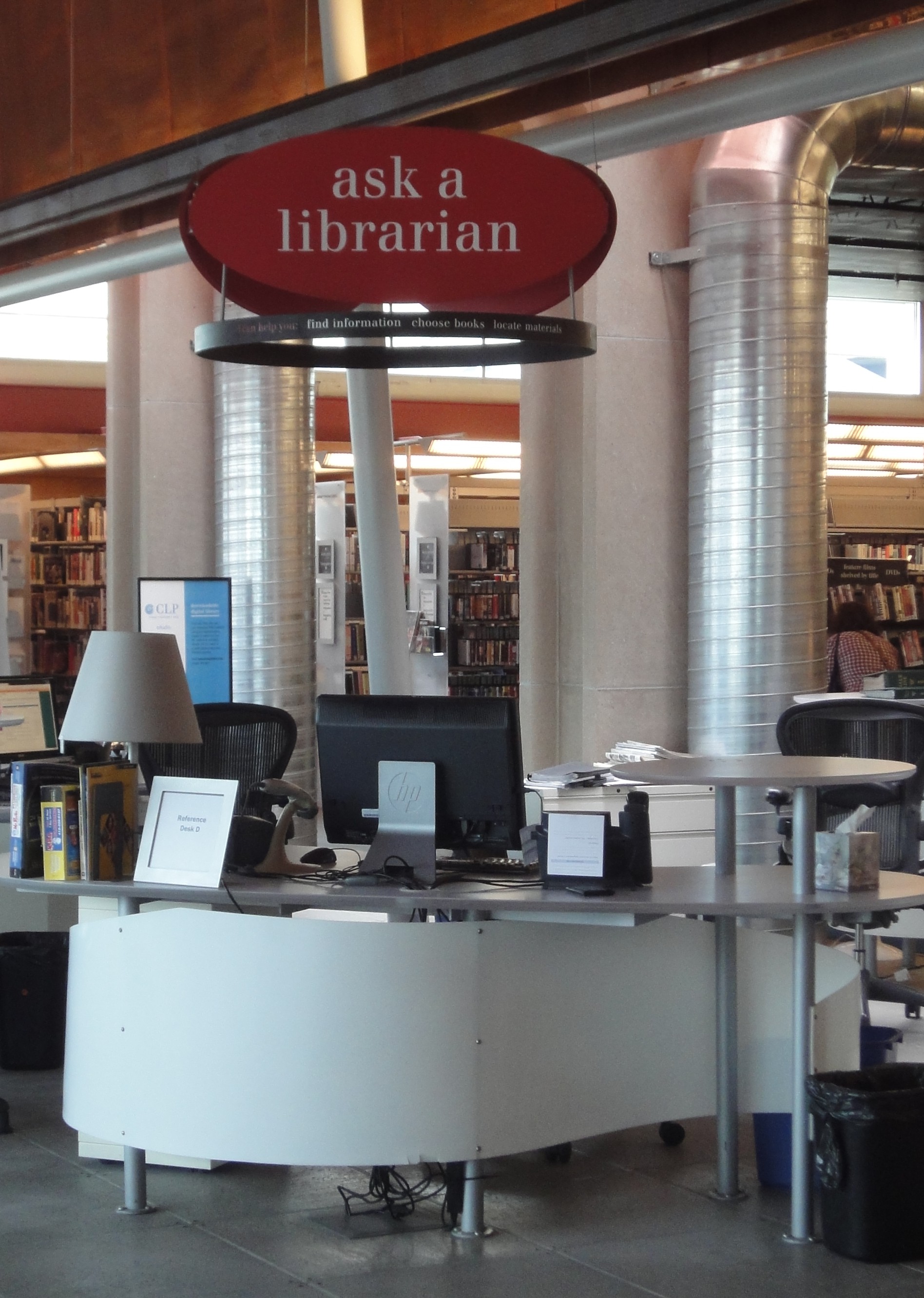
I noticed that the signage was consistent across libraries (I assume this is also the case at the rest of the branch libraries); for example, red oval signs that read “ask a librarian” hang over reference desks, and red oval “customer services” signs are posted above or hanging over circulation desks. This consistency means that any patron of any branch library can walk into any other branch and be greeted by something familiar. The language, too, is friendly: “ask a librarian” instead of “reference,” and “customer services” instead of “circulation.” Reference and circulation are familiar terms for library staff, but not necessarily for those who use libraries, especially first-time visitors.
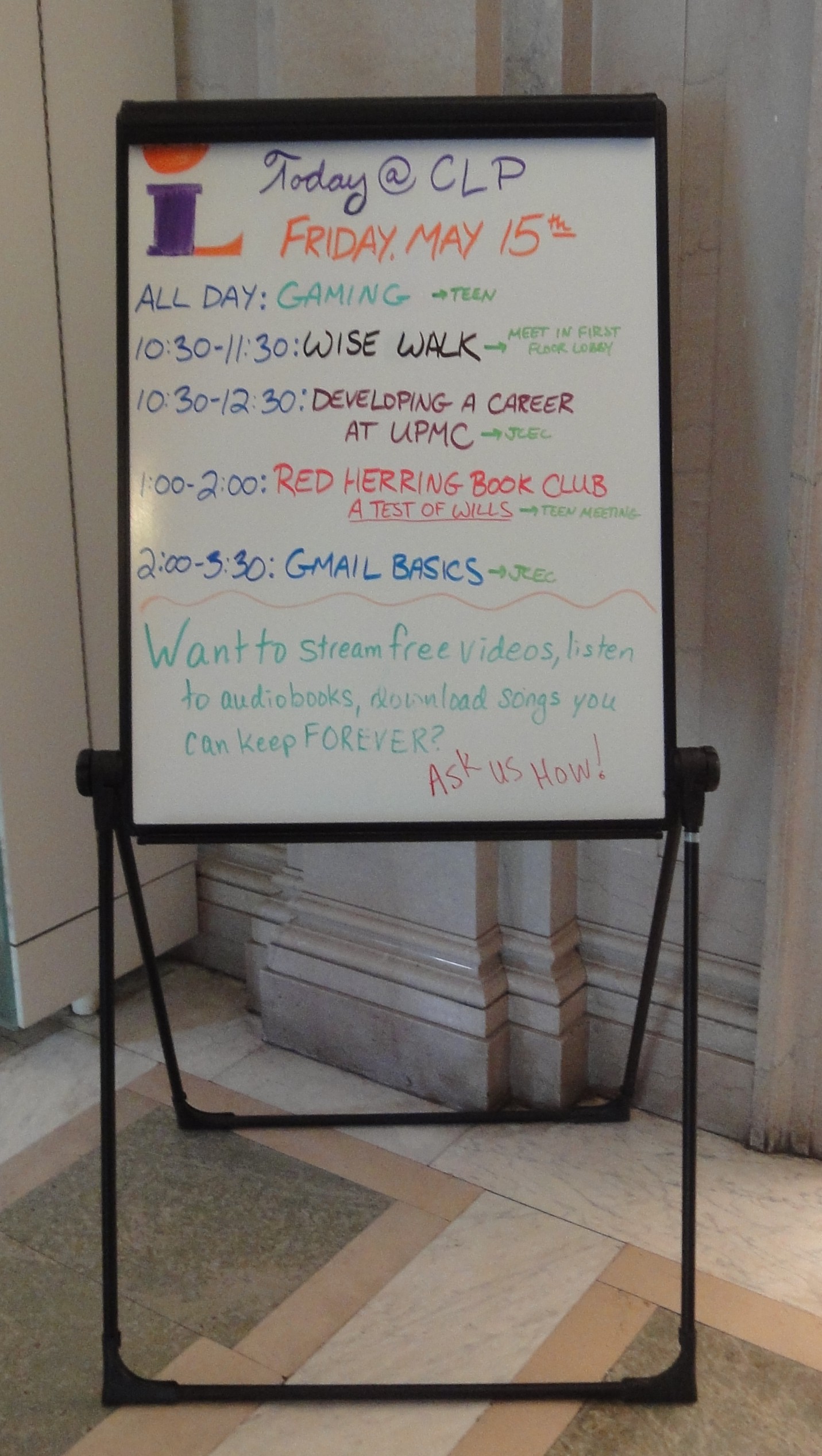 Speaking of walking into a new library, one of the first things I saw at both libraries was a simple whiteboard on an easel with that day’s events written on it. This is a low-cost idea that raises awareness of what’s going on at the library; even if you didn’t enter the library to attend a program, you’ll still see that interesting things are happening there. At my library, we’ve been debating an electronic screen that would show that day’s events as well as upcoming ones, but have been stalled because of the expense and the logistics (we can’t mount things on our old stone walls, and we don’t want cords running across the floor). But a whiteboard easel? That I think we could do.
As for more expensive ideas, I admired a few design decisions they’d made. At the Squirrel Hill branch, overhead lighting is positioned parallel to the stacks, and between them, shining light directly where it’s needed so that people browsing can see the books.
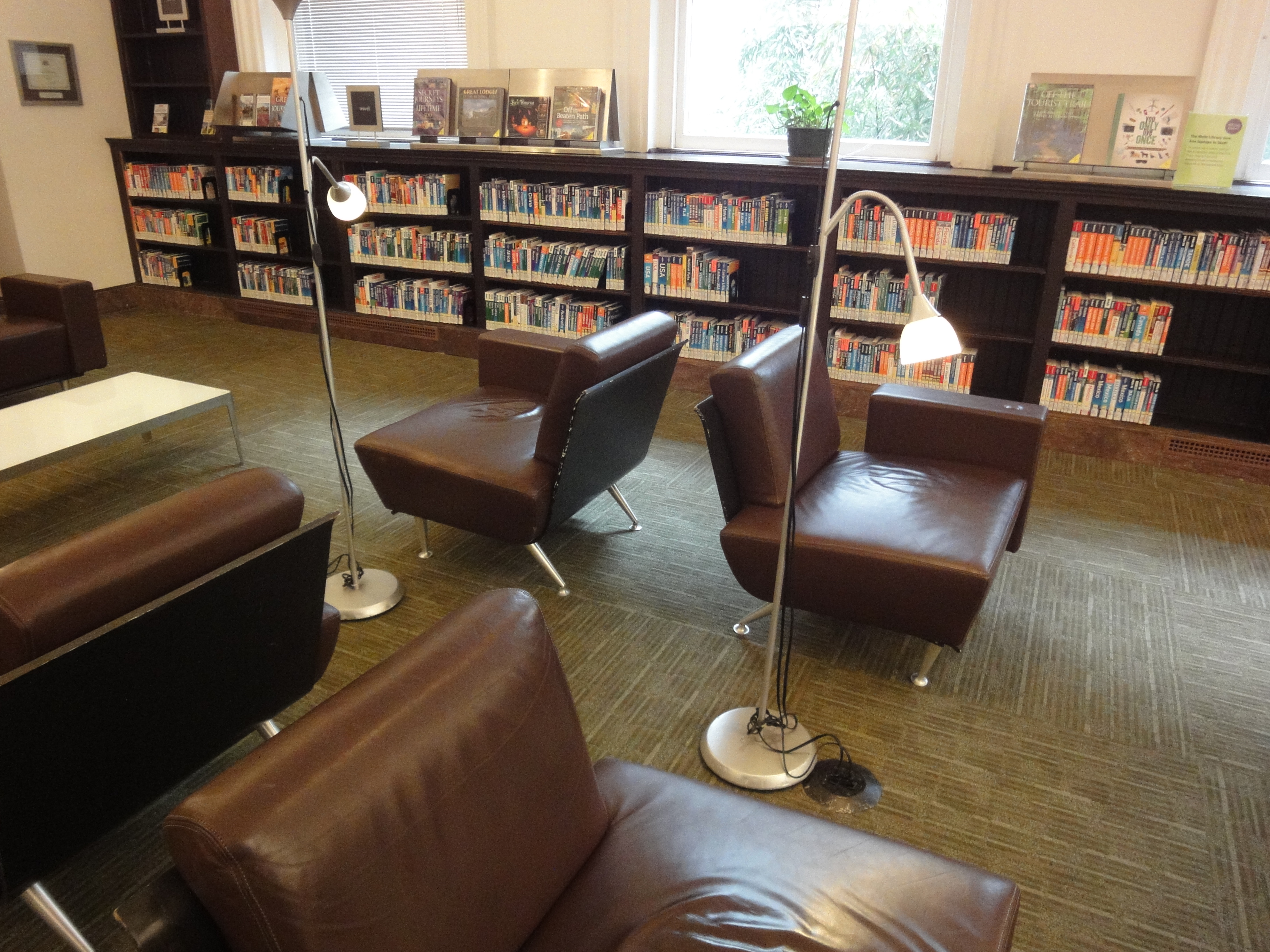 At the main library in the reference area, overhead lighting is supplemented by lamps on the tables, which people can turn on or off as desired. In a comfy seating area at the main library, standing lamps can be positioned as needed, in addition to overhead lighting and natural light from the windows. With the chairs, the lamps, and the travel guides along one wall, this section has the feel of a nice airport lounge.
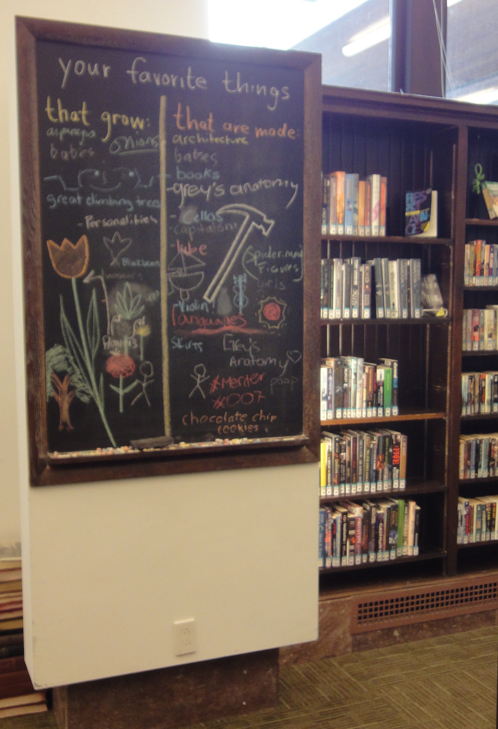 An easy interactive idea in the new books section of the main library: chalkboards. Library staff (presumably) writes a prompt, and patrons respond. This makes for a friendly atmosphere (though, as Jane Austen would say, I am not insensible to the potential for rude language to appear on public chalkboards), and reminds me of the opinion polls common now to coffee shop tip jars (“Which is the cooler superpower, invisibility or flight?” “Which are you more afraid of, failure or spiders?” etc.). It adds a little personality and sense of humor to the space, and encourages participation. Interactive elements have proven popular when we incorporate them into library displays at my library, and this one doesn’t involve covering tables with butcher paper or cutting up little slips of paper: definitely a win.
Lastly, the teen areas: in both libraries, the teen area was clearly marked by bright green overhead signs (“TEEN”), and the entrance to the area had a sign on an easel or stand that declared the space for teen use only, with a caveat in smaller print: “Everyone is welcome to browse materials in this space anytime.” This sets a clear boundary, while not being too forbidding to kids moving out of the children’s collection into YA, or to adults who like to read teen books.
Overall, I was impressed by the big and little things the two CLP libraries I saw had done to make their spaces useful and welcoming. There are more pictures on Flickr.
What are your favorite library design ideas? Please share in the comments.

When you first mentioned white boards, I was going to ask if you’d seen the post about white board polling on Letters to a Young Librarian…but then the chalkboard appeared! Glad you made it to the CLP.
An interesting post and thank you for linking to the Prezi presentation. There are lots of things I would consider implementing in our school library. I love the idea of blackboards for ideas but that requires a certain level of trust in our pupils since visitors come through the library. Wouldn’t want any naughty words appearing on them from the little scamps! I’ll definitely keep checking back on your blog to see if there are any other ideas to inspire me.
[…] with CILIP and, as part of this, I’ve been looking at other librarianship blogs. I found this post from Jenny Arch to be very interesting and the Prezi presentation she linked has given me some […]
[…] and “reference” isn’t much help. Some libraries – the Carnegie Free Library in Pittsburgh, for instance – do a better job in this area: they still have multiple desks, but the signage […]
[…] The “strategy” I developed for this assignment was simple: I would like to install a Welcome Board that all visitors to the library see upon entering the building. We have just one main entrance/exit, so the Welcome Board would be visible to all foot traffic, no matter the visitor’s ultimate destination within the library. The Welcome Board would (a) communicate a welcoming message (ideally in concert with an overhaul of library signage), and (b) promote events and programs happening in the library that day (as well as upcoming programs that week, space permitting). [Note: I’m borrowing this idea from the Carnegie Library of Pittsburgh, PA.] […]
[…] Design for flexibility. We can’t see the future, but we can safely assume it will be different from the present. Make your space as flexible as possible so that you can make changes to meet unforeseen needs and wants: renovations and new furniture are expensive, so make them count. And remember to prioritize accessibility, not simply to fulfill ADA compliance, but because the library should be welcoming and easy to use for everyone. […]