It is a truth universally acknowledged that meetings are (a) boring, and (b) a waste of time. But! That is only true of poorly run and/or unnecessary meetings. I’m lucky that my presence is required at relatively few meetings on a regular basis: my department meets monthly (and we start off with a “lightning round” for everyone to share what they’re reading/watching/listening to), the network committee I’ve been on for the past four years meets quarterly, and those have been my only regularly scheduled meetings.
Now that my tenure on the network committee has come to an end, I’ve joined a new committee that meets every other month (and not at all in the summer, which I’m actually kind of sad about). This is a committee for library staff who plan programs at their libraries, so it’s a great way to gather ideas for programs and get contact information for good presenters. It’s also fun and interesting to hear what’s going on at other libraries, what’s working well and what isn’t. As a really excellent added bonus, most meetings are held at a different library each time, rather than our usual central meeting site, so it’s an opportunity to visit libraries I might not see otherwise.
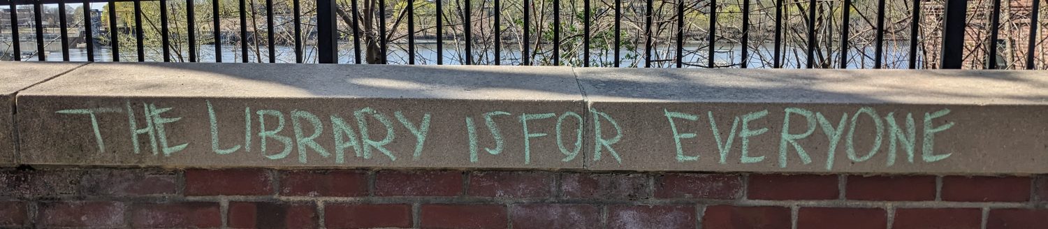
That was the case with Medfield. “Enter, engage, enjoy,” their website says, and that’s exactly what I did. The staff let us in a few minutes before the library opened, and I darted around taking pictures of everything: their displays, their signage, their collection of “unusual items” to borrow, their seed library, their chalkboard, their amazing murals (not just in the children’s area!).
I created a Google album of all my photos, annotated with comments, but here are a few of my favorite signs, because signage is so important in communicating – not just information, but atmosphere and tone and mood.


I really think Medfield knocked it out of the park: their wayfinding/directional signage is helpful, their informational signage is concise and friendly, and they also use signage to draw attention to unique collections in clear ways. It’s also both consistent and tailored: the directional signage is the same throughout the building, with white (or off-white?) text on a gray background, but smaller signs in each area have some personality that’s appropriate to the area in which they’re located (children’s, teen, etc.).
And did I mention the murals?


Do you frequent public libraries? What is some of the best signage you have seen?
