
LibraryThing has introduced a new feature that enables its users to see their libraries broken down by Dewey Decimal categories.
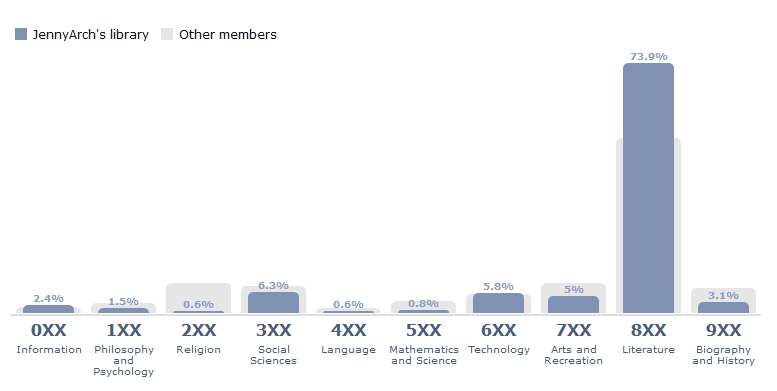
The purple bars on the chart are from my own LT library – which includes books that are on my “to-read” list as well as ones I’ve read – so these charts are not strictly a representation of my reading history, but a reflection of my reading interests overall. The pale gray bars represent the other members collectively; it’s clear that most LT users are overwhelmingly reading fiction as well.
I’m a little surprised that people aren’t reading more in nonfiction categories, particularly biography and history (and the 900s also include travel). I would guess that the LT user base includes more women than men, because – as a loose general tendency, not a hard-and-fast rule – when reading for pleasure, women tend to read more fiction, and men tend to read nonfiction. (Women also read more books than men.)
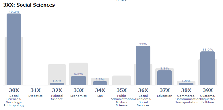
After the top-level breakdown, you can see the details within each range. For instance, here are the 300s:
This new feature is mildly interesting to users, particularly those of us in the library field, but I wonder how it will inform future LibraryThing developments. Will knowing that most users are reading mostly fiction change anything about the site or service? The blog post announcing it doesn’t say.
