MLA 2019: Active Bystanders, Civic Hub Grants, Little Women, Usability and UX

Wednesday, 9am: #WeToo: Becoming Active Bystanders, Sharon Schiffer of the Boston Area Rape Crisis Center (BARCC) 

This was a slightly smaller group, so we all introduced ourselves (including pronouns!) and Schiffer had us discuss the following questions in pairs or small groups: Have you ever felt uncomfortable? What did you do when you felt uncomfortable? Why do you think people do not talk about things that make them uncomfortable? Why should people talk about what makes them uncomfortable? What’s a bystander? What’s an active bystander? When you see a situation, why DON’T you get involved? Why DO you get involved?

Schiffer presented the “Four Ds,” strategies for active bystanders: Direct, Distract, Delegate, Delay:

  • Direct: Direct action can be verbal or physical actions that aim to address and stop the problem behavior.
  • Distract: Distraction will not solve the root of the problem, but can help someone out of an uncomfortable or dangerous situation.
  • Delegate: Delegation is a way to get others involved interrupting in problem behaviors
  • Delay: It’s never too late to take action. Delay action until you have a better understanding of the situation. Check in with someone after the fact.

10:15am: “How I Became A Warrior Mother,” Marianne Leone

Leone read a little from one of her books, Ma Speaks Up, and spoke about raising her son Jesse, and fighting for him to be included in public school classrooms. Their story reminded me very much of two novels: Out of My Mind by Sharon Draper (middle grade) and Say What You Will by Cammie McGovern (YA).

11:20am: A Force for Good: Bridging Civic Divide Through Discussion, presented by MBLC Consultant Shelley Quezada, Desiree Smelcer of South Hadley Public Library, Molly Moss of Forbes Library (Northampton), and Jessica FitzHanso of Chelmsford Public Library

The three libraries represented at this panel had all received the Civic Hub grant through the MBLC. The aim of the grant was “to strengthen the role libraries play in promoting civic engagement, providing impartial, trusted information on a variety of issues as well and providing a neutral space for the public to participate in community conversations.” Each library took a different approach to programming, collection development, and promotion; the librarians showed a knowledge of what worked in their communities (book groups in Chelmsford, lecture series in South Hadley), and had some surprises as well.

Smelcer spoke about a successful lecture series, skillfully moderated by a local debate coach. She said that by creating a safe space for people to ask questions and not get attacked for their views, more people began to open up. (“By not talking about politics and religion, you never learn how to talk about politics and religion, and it gets harder to do.”) She also mentioned a finding from the Annenberg Public Policy Center (APPC, parent of FactCheck.org) that “incivility” in Congress has actually remained relatively flat since they began monitoring it in the 1930s, but people who watch cable news believe that it has become much more uncivil (as opposed to people who watch network news).

Though Northampton is close to South Hadley, the communities are quite different; Northampton has a lot of activists, and the library wanted to raise its profile within the town by positioning itself at the center “passively and serendipitously.” Moss explained how they had divided the year into quarterly themes: Racial justice, community divides (which turned out to be “too broad”), climate change, and safety and justice. They had World Cafe-style conversations (facilitated conversation around open-ended questions) about each. For their “All Hamptons Read,” they chose Never Caught: the Washingtons’ relentless pursuit of their runaway slave, Ona Judge by Erica Armstrong Dunbar; Moss also mentioned The Common Good by Robert B. Reich. 

REACT logoChelmsford came up with a great logo and acronym; read more about their “REACT Grant” (Read, Engage, and Come Together) on their library website. They incorporated their theme (and branding) into existing programs like book clubs and lecture series, created displays, made handouts and booklists, partnered with many other organizations, and for their popular “One Book” program, chose Counting Descent by Clint Smith, an advocate for racial justice.

Lunchtime Spotlight session: Anne Boyd Rioux, author of Meg, Jo, Beth, Amy: The Story of Little Women and Why It Still Matters

Takeaways:

  • Little Women Helps girls figure out who they are and who they want to be. Each March sister is unique and has a different personality. There isn’t just one or two ways to be a girl, there are an infinite number of ways. Readers, too, can try on and reject different identities.Cover image of Meg Jo Beth Amy
  • Jo March: She is ambitious, she wants to be famous (taboo!), powerful. No one IN the book tells her she can’t or shouldn’t. Jo is defined by what she DOES.
  • Little Women is important to people not just when they’re children but as adolescents, young adults, and parents.
  • Coming-of-age narrative focused on boys; Little Women broke the mold and showed girls growing up. (And not the conventional “wild child becomes tamed” narrative – none of the March sisters are forced into a role they don’t want.)
  • Meg gets married in the middle of the book – marriage isn’t the end. When else does that happen? (Not Shakespeare, not Jane Austen…)
  • Marmee to Jo, admitting she shares her temperament: “I am angry every day of my life.” Maybe we’re ready to think of mothers as human beings, hmm…
  • What about boys, do they read Little Women? “There are real-world implications of telling boys they don’t need to understand girls’ experience.” Shout-out to author Shannon Hale, who has written a lot about this. (Here’s one article by her in the Washington Post.)
  • Librarians can help kids choose books about people different than themselves.
  • Descendents of Jo March: Katniss Everdeen, Rory Gilmore, Hermione Granger

1:45pm Do-It-Yourself Library Website Usability Testing, Jenny Arch, Callan Bignoli, Ran Cronin

User Experience Honeycomb

Our slides are here. We talked about designing and conducting usability tests in our libraries (Winchester Public Library and the Public Library of Brookline) in order to identify areas of frustration or friction for people using the library website. Where are the problems? What do people have trouble finding? What do they not know about, and how can we make these things more obvious? How can we make the experience smoother and more successful? Running a usability test with as few as five participants and six tasks can be illuminating.

2:50pm Patron First: Patron-Focused Design and User Experience, Callan Bignoli and Roy MacKenzie, Public Library of Brookline

More user experience! UX is how a person feels when using a product or service. (Delighted? Frustrated?) Usability impacts UX. Key elements of usability are navigation, familiarity, consistency, error prevention, feedback, visual clarity, flexibility, efficiency. (If, for example, most people recognize that blue text with an underline is a link you can click, don’t reinvent the wheel by making your links orange with no underline.)

UX design is a process

Bignoli advised making UX part of the library’s strategic plan and action plan, if it isn’t already, and said that it’s a process that will never be completed. Observe, identify improvements, develop, implement, repeat. “Done is better than perfect. Don’t let perfection be the enemy of good. You’re never done. You’re always going to be offering new services and evaluating your services. The final step of this process is to repeat it, and keep doing so.”

MacKenzie spoke more about library space, collections, and policies. Ideally, there is a committee with members from every library department that revisits every policy every year or two (so that you don’t end up with an Internet policy from, say, 2011). Questions to ask: What is the real goal of the policy? How does the policy impact users? Is this policy improving things for patrons or for staff? Is this policy really necessary? Is this policy enforceable? 

Regarding the library space, consider “desire lines” (do patrons keep moving furniture to different locations?) and noise levels. If the children’s area and the local history area are right next to each other, can you rearrange the space to make both audiences happy? In Brookline, they closed the main library for two days to shift the entire adult fiction collection off the ground floor, leaving the ground floor completely for youth services; they used the time they were closed for staff training.

Library collections are changing too. Ask, What do we have? What do we need? This is another area that will depend very much on the library location and population. Do your patrons want portable DVD players, cake pans, board games? Many libraries have begun building a “Library of Things” collection, from seed libraries to household tools to kitchen equipment to games, and they tend to be really popular.

Once again, there were plenty of great sessions that gave us a lot to think about at MLA this year. Thanks to the conference organizers, presenters, panelists, and everyone who was tweeting #MassLib2019.


Library (re)design: Hopkinton Public Library

hopkinton-stained-glass
“The fountain of Wisdom flows through books”

This week I attended a meeting of the MetroWest Program Planners at the Hopkinton Library, and after the meeting we got a tour of the recent redesign and addition (they reopened October 2017).

IMG_20180918_112232
Fold-up tables and lightweight chairs

There was so much to love about the new library, I almost don’t know where to begin. But if you’ve been reading here long, you know how I love mobile, modular furniture, so we can start with the fact that everything is on wheels: tables, chairs, displays, even the circulation desk (though the circ desk, we were told, is heavy and they don’t plan to move it often. The reference desk is not on wheels, but that is because it moves up and down). Many of the tables fold up, as well, so they can be folded and wheeled out of the way to make room for events.

Now, let’s go upstairs, and work our way down. Upstairs is the children’s room; it has historically been upstairs, and it was important (to the community? to the staff?) that it remain there. It had beautiful light from lots of windows; a friendly low desk with display space built into it (they feature a different kid’s collection each month); a central area with low tables and chairs; a puppet theater and a Duplo table; and plenty of little reading nooks with built-in benches (okay, not modular, but very cozy). There was also a glassed-in separate room for storytimes and other programs, with a little cart of floor mats, built-in storage cabinets, and two sinks (big and small). Perfection!

Above, clockwise from top left: A brilliant, double-pun bulletin board display; the central area of the children’s room; a puzzle corner; a reading nook.

Downstairs on the main floor is the circulation desk, new books, adult fiction, the teen room, a large meeting/conference room (formerly part of an Episcopal church, incorporated into the library in 1967 if I remember right), and a smaller board room that was part of the original library (complete with grandfather clock donated in the early 1900s).

IMG_20180918_112508

Let’s talk about the teen room: the awesome, amazing teen room! Separated by a glass wall from the public computer area, adult fiction, magazines, and newspapers, the teen area is obviously unique; visual clues such as paint color and matching carpet squares (bright blue) set it apart from the rest of the library. There is a laptop bar, plenty of comfy “mitt” chairs, tables and chairs for group work, and of course, a great selection of teen books.

IMG_20180918_113510
The teen room: laptop bar, tables and chairs, stacks with endcap displays, and the mitt chairs by the windows on the right.

Downstairs on the basement level (with with some windows high up and some skylights – skylights in the meeting rooms! – there was plenty of natural light) is the reference desk, which can move up or down with a switch, so librarians can be seated or standing. (There is also a beautiful heritage quilt on the wall behind the desk.) There is a small reference collection in addition to the nonfiction, a local history room, meeting rooms for small groups, and a larger meeting room set up as a classroom – that’s where Girls Who Code takes place, and there’s a laptop cabinet (on wheels, of course) in the room.

Above: Was it weird to take photos of these? Yes. But I love the inclusive signage AND the transparency built into the door lock so people waiting can tell at a glance if it’s vacant or occupied without having to knock or try the door.

Above: Offering bags for wet umbrellas is a nice touch (and protects the new carpet); cafe-style seating across from the circulation desk offers visitors a place to snack.

Throughout the library, most of the display space is on beautiful endcaps, where books are face-out. In many places, displays are coordinated so a flyer for an event is positioned above relevant books.  Overall, it’s an impressive, clean, friendly place that will serve its population flexibly for years to come. Bravo, Hopkinton!

Reviving the lost art of repair

In early September, the article “Libraries and the Art of Everything Maintenance” (Megan Cottrell, American Libraries, 9/1/2017) was the Library Link of the Day. The article featured a few public libraries that partnered with organizations such as Repair Cafe  and Fixit Clinic to encourage the repair of broken items, and teach people how to repair their own things.

There is so much to love about this idea. Together, libraries and Repair Cafe/Fixit Clinic:

  • help build a more sustainable world
  • fight the “throwaway” culture of obsolescence
  • encourage an interest in how things work
  • teach useful skills

For the past several years, libraries have been talking about Makerspaces – and in some cases, carving out space and buying 3D printers. While I think that 3D printers are amazing for specific purposes (like making teeth), I’m afraid a lot of them are used for churning out cheap plastic junk. They may serve as an introduction to design and robotics, which is not to be discounted…but I think the repair cafe/fixit clinic idea is so much more useful. After all, learning a skill comes easier when you have a purpose: learning a coding language, for example, will probably be a wasted effort unless there’s something you want to make with it.

In this scenario, a broken item – lamp, toaster, necklace, scooter – provides motivation for learning, the library provides space and coordinates the event, and the Repair Cafe or Fixit Clinic provides the volunteers (who may bring the tools of their trade with them). In the AL article, Cottrell writes, “The goal of the U-Fix-It Clinic [is] allowing people to repair broken items instead of throwing them away, but also inspiring them to learn more about the products they consume and how they work. The event is part of a larger movement across the globe working to help keep broken items out of landfills and revive the lost art of repair.”

Knowing how things work – and how to go about fixing them – is empowering; it’s useful knowledge.  In a piece for WGBH, “‘Fixit Clinics’ Help People Revive Their Broken Items,” Tina Martin interviewed the founder of Fixit Clinics, MIT grad Peter Mui, who said, “There’s a sense that [people] don’t have a choice when something breaks, there’s no repair people left anymore to fix this stuff.”

Mui wrote a guest blog post on ifixit.org, saying, “Once people start repairing, they start asking questions like ‘What went wrong?’, ‘Can it be fixed?’, and ‘How might it have been designed differently to avoid breaking in the first place?’ That last question is where we’re ultimately going with Fixit Clinic: to encourage products designed with maintenance, serviceability, and repairability in mind.”

As the things we use on a daily basis have become more complex (sometimes by necessity, sometimes not), design has become more opaque. I often think of Don Norman’s The Design of Everyday Things while I’m working at the reference desk, explaining the “hamburger menu” to a patron, or helping them locate the miniscule, hidden power button on our new laptops. They often apologize, and I tell them it’s not their fault – it’s poor design. But as more and more of our things have microchips inside them, instead of parts we can see and tinker with, we’ve forgotten how to open things up and explore; we’ve given up on figuring out how things work – or why they stop working.

The mentality behind the Repair Cafe and the Fixit Clinic addresses these problems in a tremendously useful way. The Repair Cafe “About” page explains, “We throw away vast amounts of stuff….The trouble is, lots of people have forgotten that they can repair things themselves or they no longer know how. Knowing how to make repairs is a skill quickly lost. Society doesn’t always show much appreciation for the people who still have this practical knowledge, and against their will they are often left standing on the sidelines.”

The Fixit Clinic’s mission has similar themes: “Fixit Clinic conveys basic disassembly, troubleshooting, and repair skills using peoples’ own broken things as the vehicle. By sharing these skills while transferring them to others we teach critical thinking through the lens of our relationship to consumption and sustainability. We strive to demystify science and technology so that we can ultimately make better policy choices as a society.”

A community learning experience that brings people together to share skills and tools, and repair items that would otherwise end up in landfills and be replaced with new things: this is a perfect program for libraries to host. The Cambridge Public Library has partnered with the Repair Cafe in Cambridge already; I’d love for our library to do this as well, and I’m keeping the idea on the back burner. (The front burners are already occupied: I’ve just launched a cookbook club this fall, which is wonderful but a lot of work. If only we had more staff…)

Related:

The end of repair? 3/11/2013

The extinction timeline, 12/29/2014?)


MLA 2017: Charting Our Course

Conference days are long and tiring, but energizing too: It’s great reconnecting with former colleagues, classmates, and other librarian acquaintances and friends from committee meetings, other conferences, etc., and sometimes putting a face to a name from e-mail or Twitter. (The official hashtag for the conference was #masslib17.) And of course, there are always plenty of new ideas to steal borrow and resources to consult.

This year I made the most of my one day of MLA, starting with an 8:30am session and including the “YA Smackdown” during lunchtime. Without further ado…the recap!

Why Don’t Patrons READ Library Signage? Graphic Design and Libraries

Presented by Larissa Farrell (YA) and Jessica Lamarre (Children’s) from the Duxbury Free Library, and Jed T. Phillips (Tech & User Experience) from the Ames Free Library

Fonts Matter example "You'll Always Be Mine" in two fonts
From the Duxbury presentation slides. Fonts matter!

This presentation was not about wayfinding signage, but about advertising and PR. Duxbury has a six-person marketing team, including one person from each department; they meet quarterly (at least) for some big-picture discussion, and work together to ensure a cohesive look across platforms (print, facebook, instagram, etc.). They suggested getting a mid-range digital camera that all library staff could use, to ensure a minimum photo quality.

The presenters explained pixels, resolution, file types, and hexidecimal (“hex”) colors, and then shared their favorite sources for free licensed fonts (fontspring.com, fontsquirrel.com) and copyright-free images (pexels.com, Google Creative Commons search, Canva, unsplash.com, pixabay.com, NASA, LOC, NYPL, Smithsonian). Remember, a picture’s worth a thousand words – but not clipart. (“Clipart is not ideal.” “Do not use clipart.”) Images, illustrations, and fonts will all begin to look dated over time, so if your library uses a template, consider refreshing your look every few years.

Screenshot of tweet: avoid comic sans and papyrus

All three presenters use the online design program Canva; libraries can get free business accounts that up to six people can use. In addition to Canva (and Canva Design School), other graphic design programs and software include Microsoft Publisher, Adobe Photoshop or InDesign, and classes through Lynda.com.

In addition to basic technical information and specific software recommendations, the presenters also discussed the principles of graphic design, and recommended Chip Kidd’s book Go: A Kidd’s Guide to Graphic Design, which I also recommend as both an intro and a refresher.

Screenshot of tweet: form after function. Hierarchy.

Additional takeaways: Make your entrance(s) welcoming. Remember that “Where is…?”-type signage can advertise your collections and services, as well as helping people orient themselves and find what they need.

Screenshot of a tweet: Clipart is not ideal.

Transforming Teen Spaces

Presented by Jennifer Forgit from the Cary Memorial Library in Lexington and Katrina Ealy from the Holbrook Public Library

While support for teen collections has grown in many libraries, spaces and programming haven’t necessarily. YALSA policy supports a space that is exclusively for teens (see YALSA’s Teen Space Guidelines). If you don’t have a dedicated teen space in your library, where do the teens congregate? Can you make that their space? Repurpose underutilized space or move things around. (Have you weeded your print reference collection lately? Really, really weeded it?)

In Lexington, Jen was part of a very long process culminating in a major shift that included renovation. “Lots of support means lots of stakeholders”: library director, staff, trustees, Teen Advisory Board (TAB), town facilities department, Friends, Foundation, architect, library patrons & donors. They were ultimately able to move adult fiction upstairs with the rest of the adult materials and create a teen space downstairs, on the same floor as the Children’s department, which made sense to most people: Jen said she encountered less resistance to change than she’d expected.

Both Jen and Kat recommended getting input from teens. Jen advised keeping your teens involved throughout the process: dreaming, planning, decision-making, fundraising, installation. Get them involved early. But don’t make promises you can’t keep. Get feedback on choices you already know are “safe” (e.g. furniture in your price range – but let them pick the color). Furniture and shelving on casters is a great idea, so the space can be reconfigured for different uses.

Screenshot of tweet: Teens love to sit on the floor. Get a cool rug.

Kat works at Holbrook now but presented about her former workplace, the South Yarmouth Library, which is a very small library in an old sea captain’s house. They were able to take over the Friends’ book sale room (“They made about five dollars a week”) to create a space for teens: they stripped old wallpaper and put on fresh paint, got a new rug and some furniture, and added cheap, cute decorations that can be replaced every so often. They didn’t have much of a budget – just enough to cover the rug and furniture – but “small changes can make a big difference.”

Once you’ve designated a teen space, post clear signage: Lexington’s Teen Space sign is about six feet tall and reads, “This room is exclusively for the use of library patrons who are in 6th-13th grade. Others are welcome to get books and other materials from the Teen Space, but please do not linger in the room.”

Advocacy tips:

  • You can use American Fact Finder to look up population stats for your town. According to the 2015 American Community Survey, about 22.5% of Arlington’s population is 19 years old or under; nearly 10% are between 10-19 years old. That’s a not-insignificant chunk of the population.
  • The #1 reason teens try drugs is boredom (followed by anxiety and loneliness). We can help with that!
  • If someone objects, “But there aren’t any teens who use the library,” reply, “If you build it, they will come.”
  • Further resources: Teen Spaces: the step-by-step library makeover by Kimberly Bolan; VOYA’s YA Spaces of Your Dreams Collection edited by Anthony Bernier; and the aforementioned Teen Space Guidelines from YALSA.

Screenshot of two tweets about teen population stats from American Fact Finder and "if you build it, they will come"

Slides and notes from the Youth Services Section presentations are or will soon be available at the MLA YSS wiki. (Here is the MLA Conference 2017 link.) Stay tuned for my next blog post(s) on Mind in the Making, the YA Smackdown, and Step Into Your Office: The Library as a Co-Working Space.

Oh – and the Robbins Library Book Cart Drill Team finally won a much-deserved first place award! Watch the video.


Where do we go from here?: a content audit of library signage

Good signs help library users answer the questions, “Where am I? What can I do here? Where can I go from here? How do I find where I want to go?”-Aaron Schmidt and Amanda Etches, Useful, Usable, Desirable (2014)

Inspired by the idea of a content audit (essentially, an inventory), I went around the public library building where I work and took pictures of every sign. The library has five floors, and I took about 250 photos. I did not include signs in staff-only areas, nor did I take pictures of every single stack end, each of which is marked with the call numbers it holds (e.g. 910-919 for travel books).

Still: about 250 signs, with 100 on the first floor alone. The sheer number of signs is overwhelming, as is the variety: there are a few different “official” styles (gray plastic plaques with white printing; brown text on a cream background in plastic or behind clear plastic), some semi-official styles (laminated or in plastic sheets), and some that are just paper and tape.

The signs serve many purposes, and to some extent they follow Schmidt & Etches’ advice: “Different types of signs (directional, identification, instructional, regulatory, informational) should be visually distinct.” Donors, for example, are acknowledged with brass plaques, whereas programs are advertised on paper in plastic holders, so they can be changed out frequently. However, even the more permanent signage has two different designs (the gray-and-white and brown-and-cream), indicating that it was probably created and installed at at least two different times. The Teen and Children’s areas also have distinct signage of their own – again, not a bad thing, as they are distinct areas of the library.

Laminated sign over post-it over button to open door mechanically
“Please DO NOT bang.” A laminated sign, a handwritten post-it, and the automatic door button itself.

Where do we go from here, with this jumble of excessive signage? Ideally, we’d take a step back and create a “brand manual” for typography/fonts, colors, and logo/wordmark, then create templates for signage, posters, brochures, and the website. (We could even re-design our library card!) Personally, I’d love to see some brighter colors, and I like the idea of using icons rather than words wherever possible; they’re recognizable at a glance (the good ones are, at least), and offer better guidance to more people (especially people whose first language isn’t English, or younger children who can’t read yet).

Do you work in (or frequently visit) a library? What’s your favorite and least favorite thing about the signage there? What other institutions have good signage ideas that libraries could borrow?

Updated 9/22/15: Here’s another great piece from Aaron Schmidt’s UX column in Library Journal, Positive Signs.” In it, he talks about accentuating the positive and eliminating the negative in library signage. In other words, don’t tell people what they can’t do, encourage them to do what they can.

Useful, Usable, Desirable: Applying User Experience Design to Your Library

Cover image of Useful, Usable, Desirable
Useful, Usable, Desirable by Aaron Schmidt and Amanda Etches (2014)

Useful, Usable, Desirable: Applying User Experience Design to Your Library by Aaron Schmidt and Amanda Etches came to my attention at the end of last year, in a blog post by Sarah Houghton (a.k.a. the Librarian in Black). I’ve been interested in usability and UX for years, and I’d read articles by Aaron Schmidt before, so I added it to my to-read list and asked my department head (who orders the professional development books for our library) to get a copy. As Sarah writes, “I could probably work for the next year on bringing our library into alignment with the principles outlined in this book, and I can honestly say it would be a year well-spent.” It’s hard not to want to dive in right away!

In order to implement any changes, however, it’s important to get buy-in from all levels, from senior administration to front-line staff, and the authors acknowledge this. They give each “checkpoint” a “difficulty rating” to indicate the scale of each and how much time and skill are required to complete it; not all changes require months-long processes and committees (thank goodness).

But let’s start at the beginning: What is user experience (UX)? According to the authors, UX is “how someone feels when using a product or service,” and the title words of the book – Useful, Usable, Desirable – are “the trinity of good UX”; they are “the three essential elements required for a great user experience at your library.”

Schmidt and Etches cover every element of the user experience in the library, including the physical space (floors, walls, furniture, bathrooms), service points (e.g. the circulation and reference desks), library policies, customer service, signage, technology, programs and services, the collection, and of course the website and social media.

Throughout, the authors focus on user-centered design. For example, they note that libraries tend to be divided between circulation and reference “because those distinctions reflect different specializations in our profession. It’s really not a user-centered way to think about service points and service desks, and it certainly doesn’t reflect the way users approach service points in our buildings.” How do library members know which desk to approach? Usually, they don’t; even labeling the desks “circulation” and “reference” isn’t much help. Some libraries – the Carnegie Free Library in Pittsburgh, for instance – do a better job in this area: they still have multiple desks, but the signage is user-friendly and free of library jargon.

National Library Symbol: white person reading a book against a blue background
The National Library Symbol

Signage and customer service are closely related. Schmidt and Etches write, “Think of the signs in your library as a form of customer service and an expression of your library’s attitude toward its members. Are they as friendly and helpful as the people in your building?” (Assuming your library staff are friendly and helpful. Remember, “An interaction with a person can equally ruin a good experience or redeem a bad one.”) Good signs help library users answer the questions, “Where am I? What can I do here? Where can I go from here? How do I find where I want to go?” These are not just questions that new library members have; sometimes regular users need to accomplish a new task at the library. Do your signs help them find what they need?

Many of the UX principles in this book were already familiar to me, but one new tool I learned about was the content audit, meaning simply a list of all the content in an area. The authors suggest conducting a content audit on a few areas, including the website, the signage in the building, and all print promotion materials. Once you have a list of all the content, you are better able to assess what’s necessary, what’s unnecessary, and what needs to be updated. Once you’ve done one content audit, keeping that spreadsheet up to date will help you keep track of website content, signage, handouts, etc., thus creating a better user experience for library members.

I could go on (see additional notes here), but suffice to say this is a fantastic, clear, compact little book that would be a great addition to any library’s professional development collection. But don’t just stick it on the shelf: it can serve as a great guide for any library that wants to improve its members’ experience of the library. And that should be all of us.


Data collection on banned and challenged books

You know when you are talking with someone and suddenly you wonder, “Wait, how did we get on this subject?” I like to be able to trace back to the original subject, as a kind of memory exercise. When the “conversation” isn’t with a person but is just you clicking from link to link on the Internet, the trail is a little easier to follow, thanks to tabs and the browser’s back button. Here was my path this morning:

All of the above links are worth reading, so I’ll only offer a very brief summary, and a few thoughts. The author of the 538 article, David Goldenberg, expressed frustration that (a) the ALA Office of Intellectual Freedom (OIF) would not hand over the raw data they collect on book challenges, and that (b) the quality of the data presented on the ALA’s site was not particularly granular or detailed and may not be statistically valid. For instance, a “challenge” might be a request to move a book from the children’s collection to the teen or adult collection, or it may be a demand that all copies of a book be removed from an entire library system. There’s a big difference between those two challenges.

In his reply to the 538 piece, Andy Woodworth delves into some of the issues behind challenge reporting and data collection. He writes that students in library school don’t learn they have an obligation to report challenges, that there may be external pressures not to report challenges, and that librarians simply may not know to report challenges. If they do report a challenge, though, there are more problems with the ALA-OIF itself: the amount of information required in the online challenge form is minimal, and the OIF does not have the budget or staff to chase down details or outcomes from the challenges that are reported. (The challenge form is also available as a PDF that can be printed, filled out, and faxed to the OIF. It’s certainly possible to find an e-mail address for someone at the OIF, but shouldn’t this be included as an option on the form?)

While I was in library school, I learned about the ALA’s Sample Request for Reconsideration of Library Resources, a form that can be adapted by any library and kept on hand in case of challenges. At both of the public libraries where I’ve worked, we have had this form ready to hand (though in my experience, challenges are exceedingly rare, at least at the adult reference desk; this is borne out by the ALA data – and many media reports – that show more challenges happen in school libraries than in public ones).

Should someone come to the reference desk with a challenge, I would be prepared with the reconsideration form. But what the form lacks, I noticed after reading Andy’s piece, is anything about reporting the challenge to the OIF. (On Twitter, Andy said he wrote it into the reconsideration policy at his library that “we reserve discretion to report challenges to the OIF.”) I don’t think it would hurt for library patrons to be aware of that, and it would remind library staff to take the extra step to report challenges when they do occur.

The granularity of the reporting, as Andy, David, and Jessamyn all pointed out, still leaves something to be desired. Every September, I put together a Banned Books Week display in the library and write about banned/challenged books and the freedom to read on the library blog. Every year, I’m frustrated by the ALA website, which, despite a redesign within the past five years, does not adhere to many of the web conventions and usability guidelines outlined in Useful, Usable, Desirable by Aaron Schmidt and Amanda Etches (about which more soon). The information architecture is convoluted and fragmented – there’s information on the ALA main site and a separate Banned Books Week website – the presentation isn’t as clear and attractive as it could be, and despite the existence of both sites, neither usually has the quality of data I want to present to our library patrons.

Both of these problems – the information itself and the organization of information – are especially vexing because information and organization is what we do. Furthermore, intellectual freedom is a core value of the library profession; Article II of the ALA Code of Ethics is “We uphold the principles of intellectual freedom and resist all efforts to censor library resources.” We need to do better, and it shouldn’t be that hard. We need to:

  • Raise awareness among library staff that reporting challenges is important and that there are ways to do it confidentially.
  • Collect more detailed data when possible and present it in as granular a fashion as possible, noting if necessary that not all reported challenges include the same level of detail.

It’s not rocket science. What are we waiting for?

MLA 2015: Through the Library Lens, Part II

Here we go, Day Two of MLA! Read about Monday sessions here.

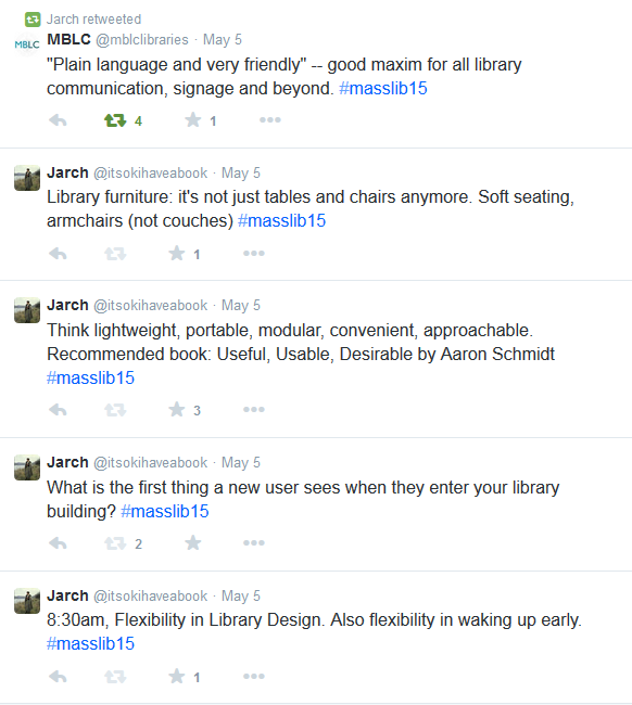
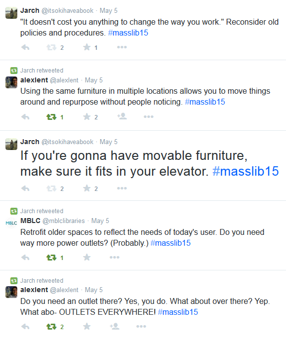
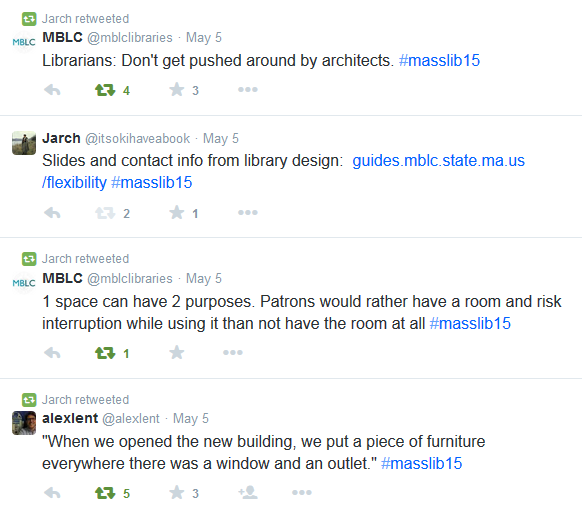
Flexibility in Library Design, or Agile Libraries that Evolve with You, presented by Lauren Stara and Rosemary Waltos of the MBLC and Sal Genovese of the Walpole Public Library (Tuesday, May 5, 8:30am)

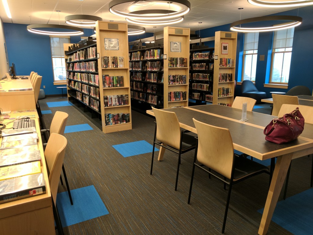
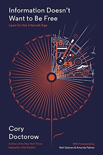
Three cheers for Lauren Stara, who posted her presentation slides online in advance of this session. Check out her slides for lots of great visuals of “lightweight, portable, modular, convenient, approachable” furniture, from service desks to comfy chairs; she included examples from many libraries in the U.S. and Canada. (The presenters’ contact info and a link to several useful Pinterest boards are available through that link as well.) There were tons of tweets during this session (see below), and between those and the slides, I don’t have much to add except that I’m in favor of flexible, adaptable design in libraries and I want to use at least 75% of these ideas right away. Also, I’ve added Aaron Schmidt’s Useful, Useable, Desirable to my ever-growing to-read list.

Screenshot of tweets including What is the first thing a new user sees when they enter your library building?Screenshot of tweets including If you're gonna have movable furniture, make sure it fits in your elevator.Screenshot of tweets, including "When we opened the new building, we put a piece of furniture everywhere there was a window and an outlet."

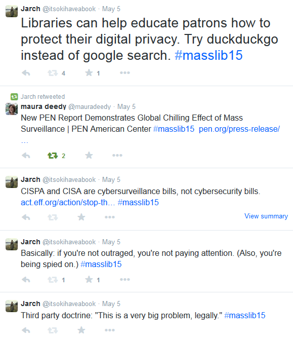
An Introduction to Fighting Surveillance and Promoting Privacy in Libraries, presented by Alison Macrina of the Library Freedom Project and Kade Crockford of the ACLU (Tuesday, May 5, 9:50am)

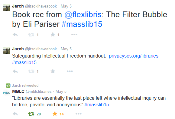
I’ve heard Kade and Alison before, but even though most of their presentation was familiar, it’s worth hearing and sharing again – plus I picked up a couple of new tips, as usual. Alison introduced a whole series of online privacy tools, which are also collected on the Library Freedom Project’s resources page.

Libraries can introduce patrons to some of these tools by installing them on public computers, and posting signs to explain the changes and raise awareness about protecting online privacy. The TOR browser is one option (“it’s not just for criminals anymore!”), and the Firefox browser with the DuckDuckGo search engine and HTTPS Everywhere and Privacy Badger plugins is another great choice. (I’m planning to switch from the Ghostery plugin to Privacy Badger, after learning that Ghostery sells information to advertisers – though this is something you can control in your settings if you do have it installed.) Good privacy options (secure texting and phone calls) for mobile phones  can be downloaded from Open Whisper Systems.

Screenshot of tweets, including Libraries can help educate patrons how to protect their digital privacy. Try duckduckgo instead of google search.

Screenshot of tweets, including Book rec from @flexlibris: The Filter Bubble by Eli Pariser #masslib15

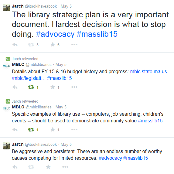
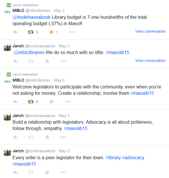
Advocacy and Your Library, with panelists Edward M. Augustus, Jr., City Manager of Worcester; Representative Kate Hogan, 3rd Middlesex, Chair, Public Library Caucus; John Arnold, Town Moderator, Westborough. Moderators: Susan McAlister, Dinah O’Brien, and Beverly Shank, MLA Legislative Committee Co-Chairs  (Tuesday, May 5, 11:15am)

The takeaway point from this session: the importance of building a relationship with local legislators so that your only contact with them isn’t when you’re asking for money. (At the same time, “You are never going to get what you want if you don’t ask for it.”) It’s important for library staff to be involved, and also to encourage library trustees and patrons to advocate for the library; often, a patron’s voice is more persuasive to a legislator than a librarian’s. When librarians do speak on behalf of the library, the focus ought to be “We’re not here to preserve my job, we’re trying to make the community a better place.”

Demonstrating real outcomes for real people, through qualitative (anecdotes, stories) and quantitative (numbers and statistics) evidence, is most effective. Collaborating and building coalitions with other community groups is also helpful; there are many groups and limited resources. That said, libraries do a lot with a little – specifically, with 0.07% of the Massachusetts state budget.

Screenshot of tweets, including Be aggressive and persistent. There are an endless number of worthy causes competing for limited resources. #advocacyScreenshot of tweets, including Library budget is 7 one-hundredths of the total operating budget (.07%) in Mass!!

A Whale of a Good Time: Summer Library Programming for All Ages, presented by Jennifer Harris and Margaret McGrath of the Plymouth Public Library (Tuesday, May 5, 2:30pm)

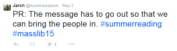
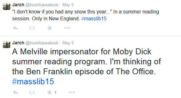
Attendees had two choices during this session: get inspired, or take your ball and glove and go home, because this was a hell of a summer reading program/community read (“One Book, One Community”). First of all, they got people to read Moby-Dick, which is impressive on its own. Second, they did a massive PR push, with mailings to 25,000 households and visits to all the elementary schools, raising awareness for all ages; high school art students were recruited to help with PR design. Third, they used every last drop of a $3,000 programming budget, spreading programs for all ages throughout the summer. Programs included three book discussions (it’s 600+ pages, folks), concerts on the lawn in front of the library, knot-tying lessons, a mini-readathon, a craft program series for teens, a hard tack tasting (verdict: not tasty), a movie screening, a Melville impersonator, a field trip to the New Bedford Whaling Museum, and visits from two separate inflatable whales.

Key to the success of the Plymouth Public Library program was staff buy-in and great brainstorming sessions, as well as a healthy budget, good planning, and great PR (in addition to the mailings, they were active on Facebook, Twitter, Flickr, and Pinterest, and events appeared in the Boston Globe and on local TV as well).

Our library does a Community Read (Arlington Reads Together) in the spring, separate from our summer reading programs for children, teens, and adults. I’m curious how many other libraries combine their Community Read with summer reading.

Screenshot of tweet: PR: The message has to go out so that we can bring the people in. #summerreading #masslib15Screenshot of tweet: "If someone doesn't call you back, and you call a few days later and they still don't call you back, move on!" #lifeadvice #masslib15Screenshot of tweets: A Melville impersonator for Moby Dick summer reading program. I'm thinking of the Ben Franklin episode of The Office. #masslib15

RA Toolbox: Staying Alive – Readers’ Advisory Continuing Education, presented by Laurie Cavanaugh of the Holmes Public Library, Nanci Milone Hill of the Parker Memorial Library, Molly Moss, of the Forbes Library, and Leane M. Ellis of the Lucius Beebe Memorial Library (Tuesday, May 5, 4:15pm)

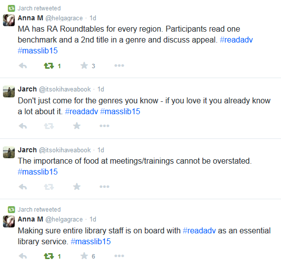
Each panelist in this session had been the recipient of a LSTA grant for readers’ advisory, administered through the MBLC, so each panelist talked about how they’d implemented the grant, as well as how they’d come to be interested (and expert) in readers’ advisory. Molly had a background in science and academic libraries; readers’ advisory was the most intimidating part of working at a public library reference desk for her. She tackled the task and became involved in the Adult Reading Round Table (ARRT) of Illinois. There is now a Readers’ Advisory Round Table (RART) for every region of Massachusetts (Northeast, West, Metrowest, Southeast), and each one has a blog.

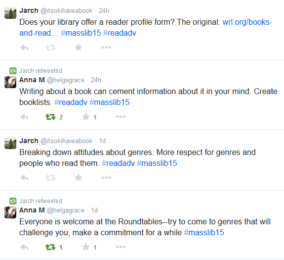
Grant money can be put toward speaker fees, conference fees, materials (books), shelf talker materials (those plastic things that clip on to shelves), staff time, and mileage. Nanci invited Duncan Smith from NoveList to speak to her staff, as well as the Sisters in Crime; Molly invited Barry Trott of the Williamsburg (VA) Regional Library. The WRL was the first library to put a “reader profile form” online; many libraries, including the Forbes in Northampton and the Robbins in Arlington, have adapted the form (with permission) to use on their own websites. Librarians at the Forbes have also done blitz-style RA, asking patrons to post to the library’s Facebook wall with a book they liked, and recommending another book based on that one.

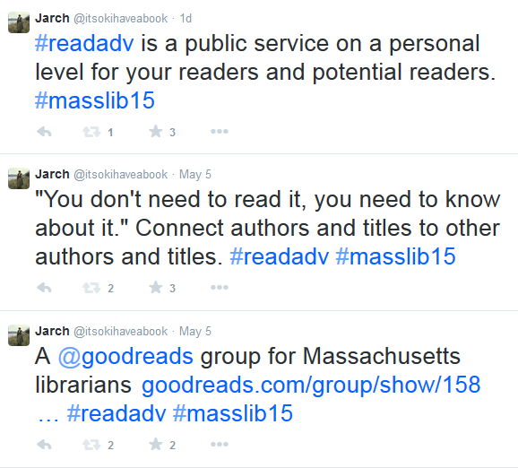
All the panelists talked about genre studies. A typical model includes monthly or bi-monthly meetings where participants read one “benchmark” book in a genre or subgenre, and one secondary selection. This allows for common ground (the book everyone read) and new recommendations. Genre studies can be done within a library, in partnership between two libraries, and through the round table groups across the state. Virtual participants are welcome in the Massachusetts Readers’ Advisory Goodreads group.

Laurie said that readers’ advisory was “customer service in the digital age,” providing a personal touch. Leane, too, said that RA was “public service on a personal level for your readers and potential readers.” Customized forms are just one way to provide great recommendations to patrons; other models include “five to try” booklists, “If you like [author/title, TV show, etc.], you might also like [___],” subgenre booklists, and staff picks lists.

This session concentrated on the LSTA RA grant and implementing genre studies, rather than specific RA tips such as including appeal factors as well as a summary when talking or writing about a book (and no spoilers!). The RA interview was covered in a previous session, RA Toolbox: Conversing with the Reader – the Readers’ Advisory Interview. Additional RA tips and resources are available from MLS. The MLA RA Toolbox handout should, hopefully, be available soon on the Presentations & Handouts page of the conference site.

Screenshot of tweets including #readadv is a public service on a personal level for your readers and potential readers.Screenshot of tweets including Making sure entire library staff is on board with #readadv as an essential library service. #masslib15Screenshot of tweets including Writing about a book can cement information about it in your mind. Create booklists. #readadv #masslib15 2 retweets 1 favorite

Overall, a great conference experience that gave me plenty of ideas and resources to follow up on in the coming weeks, plus an opportunity to see friendly faces from grad school, past library work, fellow committee members, and even friends from Twitter.

If you have questions about any of these recaps, or have written your own recaps to share, please ask or link in the comments!
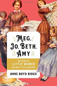
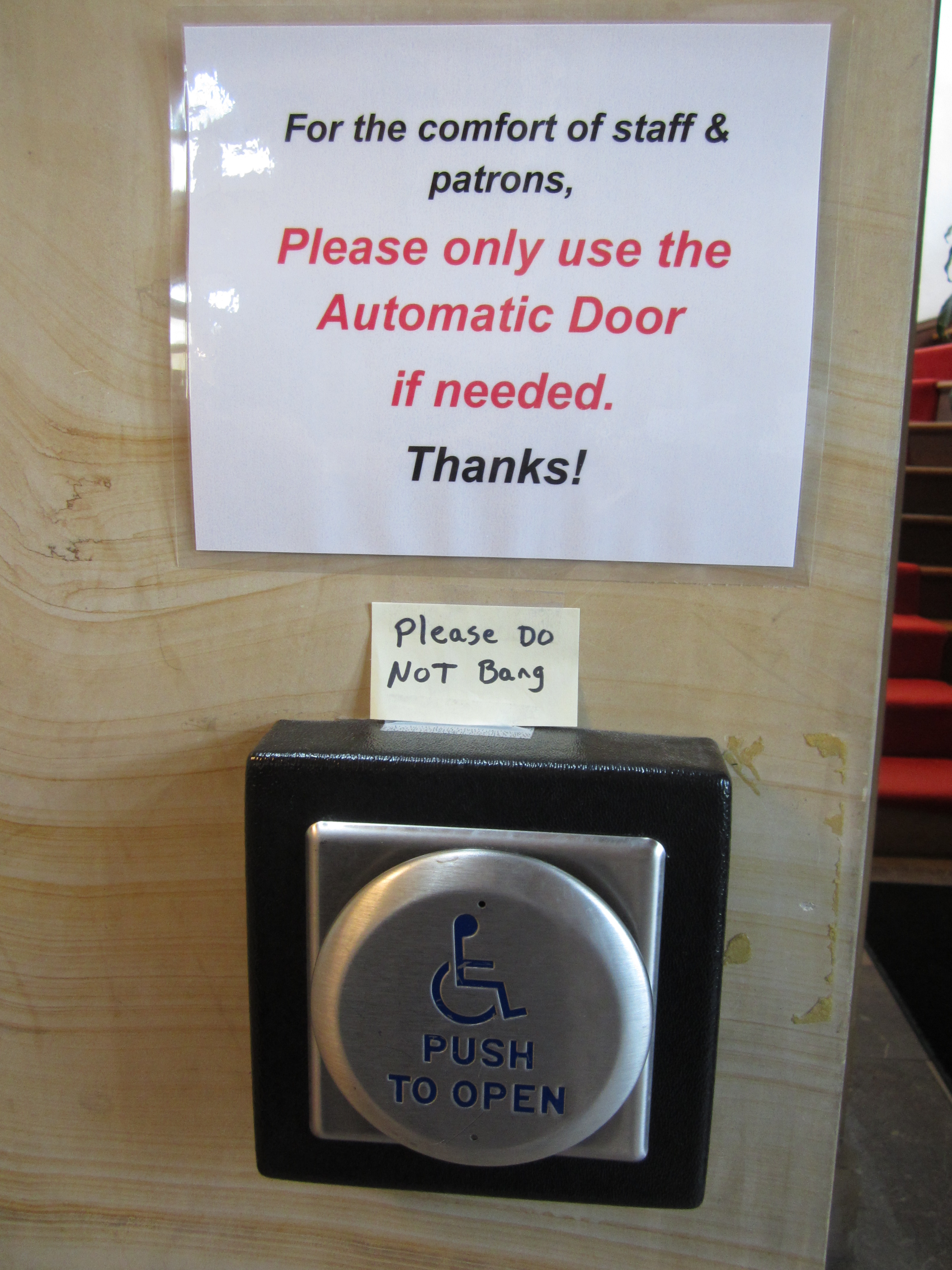
 

Information Doesn’t Want to Be Free by Cory Doctorow

cover image of Information Doesn't Want to Be FreeCory Doctorow is one of the most articulate and outspoken advocates for online privacy and sensible copyright laws; he is staunchly opposed to Digital Rights Management (DRM). As “Doctorow’s First Law” states, Any time someone puts a lock on something that belongs to you and won’t give you the key, that lock isn’t there for your benefit. His newest book, Information Doesn’t Want to Be Free: Laws for the Internet Age, is organized into three sections, one for each of his laws.

Doctorow’s First Law has been illustrated neatly by two excellent webcomics: “Steal This Comic” (xkcd, a.k.a. Randall Munroe) and “I tried to watch Game of Thrones and this is what happened” (The Oatmeal, a.k.a. Matthew Inman). Both comics make the point that buying digital content through official online platforms (a) can be difficult-to-impossible, and (b) means you can’t take it with you, whereas illegally downloaded content can be used on any device or platform.

Plenty of consumers want to pay creators for their work, but also want control over that content once they’ve bought it. (As Amanda Palmer writes in her foreword to the book, “People actually like supporting the artists whose work they like. It makes them feel happy. You don’t have to force them. And if you force them, they don’t feel as good.”) Digital locks – DRM – tie up our digital purchases in ways that make them complicated to use and sometimes make them outright obsolete. This is frustrating for law-abiding people who just want to be able to bring an audiobook from computer to car to digital media player of choice, or who want to read an e-book on any device they happen to have, no matter what operating system it’s running. There’s no reason an e-book file from Amazon should be incompatible with a Kobo device, except of course that Amazon – not the author, not the publishers (anymore) – wants it that way.

Doctorow’s Second Law applies more to creators than consumers: Fame won’t make you rich, but you can’t get paid without it. He’s not talking Lady Gaga levels of fame; simply, if you’re an artist, no one can buy your work if they don’t know it exists. The Internet can work to connect content creators with a potential audience. However, Cory writes, “The fewer channels there are, the worse the deal for creators will be. Any choke point between the creator and the audience will turn into a tollbooth, where someone will charge whatever the market will bear for the privilege of facilitating the buying and selling of creative work.” The publisher Hachette realized this belatedly with Amazon last year; by requiring DRM on all the e-books they sold, publishers handed over control to the retailers, who aren’t about to give it up. Authors – the creators – were caught in the middle.

I marked more pages in the third section of the book than in the previous two combined. Doctorow’s Third Law states, Information doesn’t want to be free, people do. As a creator himself, Cory isn’t against copyright, but he points out the difference between industrial regulation and regulation on an individual level: “Copyright is alive and well – as an industrial regulation. Copyright as a means of regulating cultural activities among private individuals isn’t dead, because it’s never been alive.

The entertainment industry – particularly Hollywood movie studios and record companies – want to be able to regulate copies on the individual level, at the expense of personal privacy. However, their arguments that piracy is destroying the industry have been neatly shot down by none other than the GAO, who said that it would be “difficult, if not impossible, to quantify the net effect of counterfeiting and piracy on the economy as a whole.” YouTube is a particular thorn in the entertainment industry’s side, even though, mathematically, only a tiny fraction of content on YouTube is potentially copyright-infringing. (To calculate this, Cory multiplied every entry in IMDB by 90 minutes per program (low for movies, high for episodes of TV shows), which comes to only about 28 days’ worth of YouTube uploads.)

When movie studios and record companies attempt to place artificial restrictions on individuals by adding DRM and other kinds of digital locks on their media and media players, they are attempting (unsuccessfully) to protect their content, but “You can’t ‘protect’ devices from their owners unless you can update them without their owners’ knowledge or consent.” This is a dangerous area. As Cory writes, “when technology changes, it’s usually the case that copyright has to change, too.…[but] the purpose of copyright shouldn’t be to ensure that whoever got lucky with last year’s business model gets to stay on top forever.”

Cory argues that we need a new system of copyright, one that “that enables the largest diversity of creators making the largest diversity of works to please the largest diversity of audiences.” The Internet allows the kind of direct connection between creators and audience that hasn’t been possible before, and copyright must adapt so that it continues to protect content, not middlemen.

Information Doesn’t Want to Be Free is familiar ground for longtime Doctorow readers and those who follow the “copyfight” in general, but it’s also a good introduction for those who haven’t thought much about the issue.

See also: “4 Ways Copyright Law Actually Controls Your Whole Digital Life” by Kate Cox at Consumerist (January 22, 2015)

Don’t Make Me Think! by Steve Krug

cover of Don't Make Me Think by Steve Krug, 2014 editionI first heard about Don’t Make Me Think! by Steve Krug in grad school, but as William Goldman wrote in The Princess Bride, “What with one thing and another, three years passed.” (Actually, it may even have been four years; long enough, anyway, for a new edition to be published, so you see, every now and then procrastination pays off.)

That said, I highly recommend you make this book the next one you read. Don’t Make Me Think! is about usability, and specifically about usability as it pertains to websites (and now mobile sites and apps as well). While usability has many attributes – a website may be useful, learnable, memorable, effective, efficient, desirable, delightful – Krug’s definition of usability is as follows:

“A person of average (or even below average) ability and experience can figure out how to use the thing to accomplish something without it being more trouble than it’s worth.”

Krug’s writing is accessible, clear, funny, and peppered with relevant examples and illustrations; he cites many sources, including Jakob Nielsen, Don Norman (author of the excellent The Design of Everyday Things), and Ginny Redish (author of Letting Go of the Words). He explodes the myth of “the average user” (“All web users are unique and all web use is basically idiosyncratic”) and shows the value of usability testing as a way forward when designers and developers don’t agree. Krug writes, “Usability testing tends to defuse most arguments and break impasses by moving the discussion away from the realm of what’s right or wrong and what people like or dislike and into the realm of what works or doesn’t work. And by opening our eyes to just how varied users’ motivations, perceptions, and responses are, testing makes it hard to keep thinking that all users are like us.”

In addition to explaining why usability is important, Krug suggests some specific guidelines. For example, format text on your site to support scanning by:

  • using plenty of headings
  • keeping paragraphs short
  • using bulleted lists
  • highlighting key terms

Krug highlights the importance of site navigation, which, as he sees it, has three important functions:

  • It tells us what’s here (“Navigation reveals content!”)
  • It tells us how to use the site
  • It gives us (the user) confidence in the people who built [the site]

Krug also advises using clear language – no specialized jargon or cutesy labels – and making the information you know people will be looking for, like contact information, available in a logical place. Ultimately, “Usability is about serving people better by building better products.”