
Good signs help library users answer the questions, “Where am I? What can I do here? Where can I go from here? How do I find where I want to go?”-Aaron Schmidt and Amanda Etches, Useful, Usable, Desirable (2014)
Inspired by the idea of a content audit (essentially, an inventory), I went around the public library building where I work and took pictures of every sign. The library has five floors, and I took about 250 photos. I did not include signs in staff-only areas, nor did I take pictures of every single stack end, each of which is marked with the call numbers it holds (e.g. 910-919 for travel books).
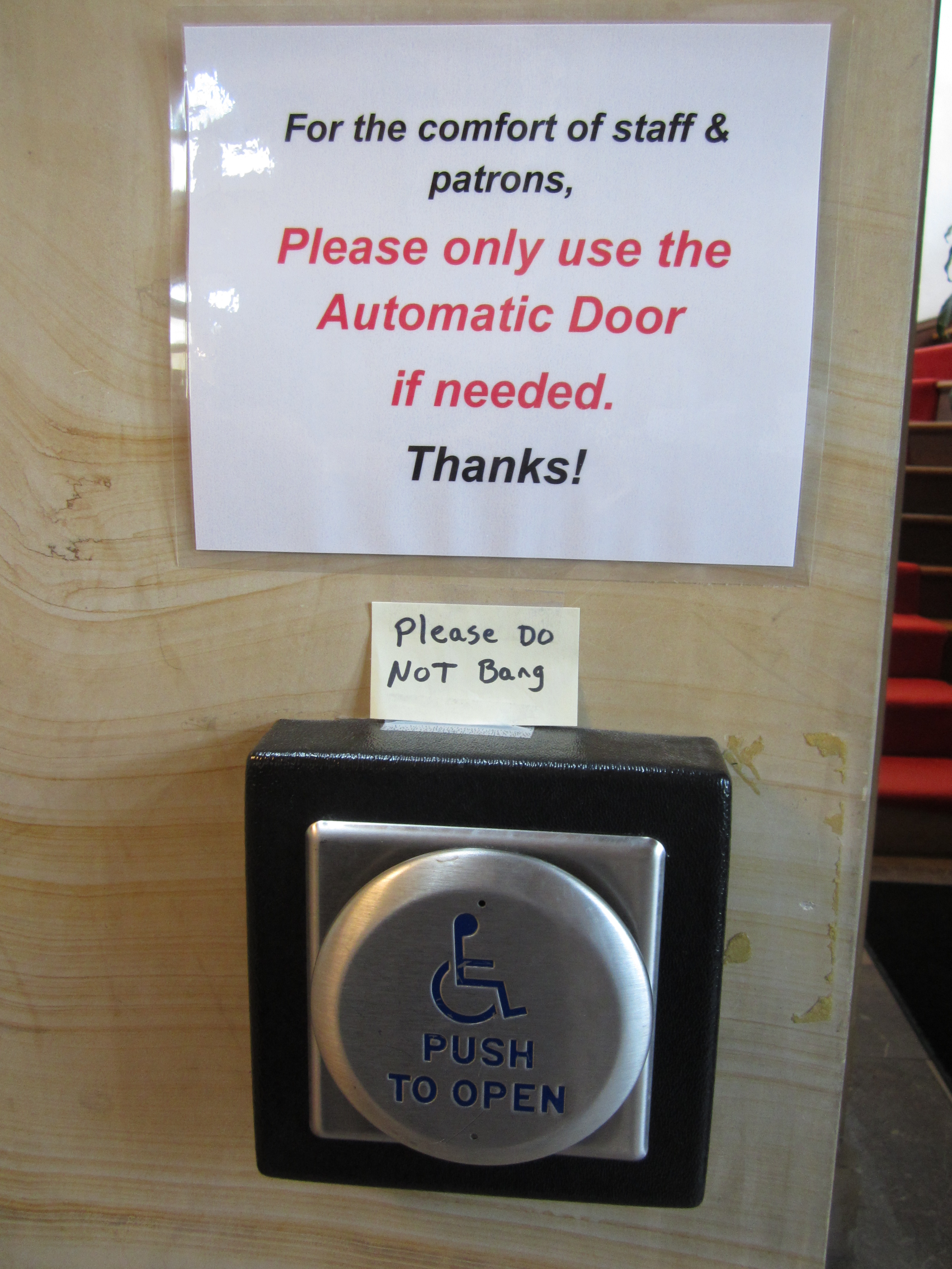
Still: about 250 signs, with 100 on the first floor alone. The sheer number of signs is overwhelming, as is the variety: there are a few different “official” styles (gray plastic plaques with white printing; brown text on a cream background in plastic or behind clear plastic), some semi-official styles (laminated or in plastic sheets), and some that are just paper and tape.
The signs serve many purposes, and to some extent they follow Schmidt & Etches’ advice: “Different types of signs (directional, identification, instructional, regulatory, informational) should be visually distinct.” Donors, for example, are acknowledged with brass plaques, whereas programs are advertised on paper in plastic holders, so they can be changed out frequently. However, even the more permanent signage has two different designs (the gray-and-white and brown-and-cream), indicating that it was probably created and installed at at least two different times. The Teen and Children’s areas also have distinct signage of their own – again, not a bad thing, as they are distinct areas of the library.
Where do we go from here, with this jumble of excessive signage? Ideally, we’d take a step back and create a “brand manual” for typography/fonts, colors, and logo/wordmark, then create templates for signage, posters, brochures, and the website. (We could even re-design our library card!) Personally, I’d love to see some brighter colors, and I like the idea of using icons rather than words wherever possible; they’re recognizable at a glance (the good ones are, at least), and offer better guidance to more people (especially people whose first language isn’t English, or younger children who can’t read yet).
Do you work in (or frequently visit) a library? What’s your favorite and least favorite thing about the signage there? What other institutions have good signage ideas that libraries could borrow?
Updated 9/22/15: Here’s another great piece from Aaron Schmidt’s UX column in Library Journal, “Positive Signs.” In it, he talks about accentuating the positive and eliminating the negative in library signage. In other words, don’t tell people what they can’t do, encourage them to do what they can.

[…] The Welcome Board would (a) communicate a welcoming message (ideally in concert with an overhaul of library signage), and (b) promote events and programs happening in the library that day (as well as upcoming […]