
Not a long post, just an observation. It used to be that when you had Gmail open, all your menu options for other Google tools (calendar, etc.) were listed across the top of the page, like so:
![]() Sorry the image is so small; click to enlarge, or perhaps Google hasn’t forced you over to the new look yet.
Sorry the image is so small; click to enlarge, or perhaps Google hasn’t forced you over to the new look yet.
It was just one click to get to your calendar, drive, groups, etc. As an avid user of the calendar and drive features, this was handy for me.
Now, all those menu options are stored almost invisibly over in the upper-right-hand side of the page. You have to know to click on the icon that is made of of nine squares:

In what language does “square of squares” mean “menu options”? To me it looks like a waffle.
Now, instead of taking one click to open my calendar, it takes two clicks: one click on the squares, which opens up the following menu, and a second click to choose which feature to open.

Aha! Here they are.
Why make these items harder to access, when the principles of usability call to minimize the number of clicks it takes to accomplish a task? I don’t know.
The number of clicks is the more annoying part of this, but the vague icon is also bothersome. This isn’t Google’s only vague icon, to be sure. There’s also this:
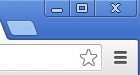
Three horizontal bars. I know that’s an I Ching trigram, but what does it mean in a web browser?
Google Chrome users will recognize the above image from the upper-right corner of the browser. The light blue parallelogram shape opens a new tab; its location is indicative of what it might do, so that’s okay. Minimize, maximize, and close are all standard icons. Clicking the star will bookmark whatever page you happen to be on. Three horizontal bars…? Oh hey, here’s the menu we’re used to seeing all the way over on the left: save, print, find, settings, etc. (Let me tell you, this confuses the less tech-savvy library patrons no end, and why shouldn’t it? There is no natural mapping.)
Speaking of icons, I remember reading one or two excellent articles (with examples) in my Usability and User Experience class at Simmons, but they were either saved in Google Reader (RIP) or Delicious (to which I am trying to regain access). If I’m able to dig it/them up, I’ll post them here; meanwhile, feel free to share any links about good design in the comments.
Edited to add (10/8/13): Found it! Thanks to the responsive team at Delicious, I was able to access my old account. The article, from UX Movement about two years ago, is called “9 Rules to Make Your Icons Clear and Intuitive.”

Late response because I’m behind on my reading, but this is an infuriating trend. It’s not just google – after my iphone updated to iOS 7 deleting emails and podcasts can no longer be done by just swiping to the right and choose the trash icon. Now I have to go into each email to delete it. And for podcasts – gah! – from the list view I have to choose “edit” then check off each one I want to delete and then choose “delete.” Who decided it was a good idea for everything to involve more steps and take longer?
I don’t know! Invisibility violates the principles of good design. It’s like we’re going backward.
[…] fall I wrote about Google’s redesign (which actually increased the number of clicks it took to get something done). Sure, it’s a […]