
Last fall I wrote about Google’s redesign (which actually increased the number of clicks it took to get something done). Sure, it’s a “cleaner, simpler” look, but how did it get cleaner and simpler? To put it plainly: they hid stuff.
For those who are continually riding the breaking wave of technology, these little redesigns cause a few moments of confusion or annoyance at worst, but for those who are rather more at sea to begin with, they’re a tremendous stumbling block.
Today in the library, I helped an 80-year-old woman access her brand-new Gmail account. She signed on to one of the library computers with her library card – no problem there. Then she stared at the desktop for a while, so I explained that she could use one of three browsers – Chrome, Firefox, or Internet Explorer – to access the Internet. “Don’t confuse me with choices, just tell me what to do. Which one do you like?” she asked.
I suggested Firefox, and she opened the browser. The home screen is set to the familiar Google logo and search bar, surrounded by white space. I pointed up to the corner and told her to click on Gmail:
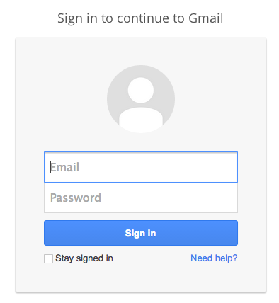
 Then came the sign-in screen, asking for email and password; at least the “sign in” button is obvious.
 Next, we encountered a step that asked her if she wanted to confirm her account by getting a mobile alert. I explained that she could skip this step, but she clicked on it anyway, then got frustrated when her inbox didn’t appear.
Now, here’s something that anyone who has ever put up any kind of signage probably knows: People don’t read signs. They don’t read instructions. Good design takes this into account; as Don Norman (The Design of Everyday Things) says, “Design is really an act of communication.” Good design communicates with a minimum of words and instructions.
In this case, I canceled the prompt for her and we got to her inbox. I showed her that she had three e-mails – informational, “welcome” e-mails from Gmail itself – and upon seeing she had no mail, she wanted to sign out. “Do I just click the X?” she asked, moving the mouse up to the upper right hand corner of the program. I explained that clicking the red X would close the browser, but that she should sign out of Gmail first (even though the library computers wipe out any saved information between patrons).
But is there a nice big button that says “Sign out”? No, there is not. Instead, there’s this:
 How on earth would a new user know to click on that to sign out? She wouldn’t. And the thing about new users (very young ones excepted, usually) is that they don’t want to go around clicking on random things, because they’re afraid they will break something, or make a mistake they can’t correct or backtrack from.
I think the above scenario will be familiar to anyone who works in a public library, not to mention anyone who has tried to help a parent or a grandparent with a computer question. It’s easy to get frustrated with the user, but more often than not the blame really rests with the designer – and yet it’s not the designers who are made to feel stupid for “not getting it” or making mistakes.
And it isn’t just beginning users who run into these problems. Sometimes it seems as though designers are changing things around just for the sake of change, without making any real improvements. Examples spring to mind:
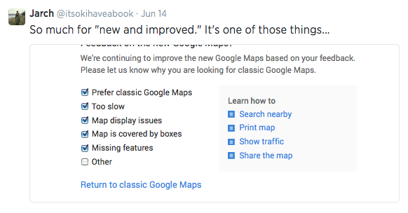
Think the latest “upgrade” to Google Maps. If there are checkboxes for all the things you already know are problems, why push the new version?
Even Twitter, which is usually pretty good about these things (and which got stars across the board in the EFF’s most recent privacy report, “Who Has Your Back?: Protecting Your Data From Government Requests”), is not immune to the making-changes-for-no-reason trend:

But perhaps the most notorious offender of all is iTunes:


To quote Don Norman (again), “Once a satisfactory product has been achieved, further change may be counterproductive, especially if the product is successful. You have to know when to stop.“
To this end, I would suggest to all designers and front-end developers: please, run some user testing before you make changes, or as you’re creating a new design. Get just five people to do a few tasks. See where they get confused and frustrated, see where they make mistakes. Remember (Norman again), “Designers are not typical users. Designers often think of themselves as typical users…[but] the individual is in no position to discover all the relevant factors. There is no substitute for interaction with and study of actual users of a proposed design.“
Edited to add: WordPress isn’t immune, either.

Is it “easier”? Is it “improved”? How so? I’m OK with the way it is now, thanks…but soon I’m sure I won’t have a choice about switching over to the new, “easier,” “improved” way.

Oh WordPress is terrible for this stuff too! I think there are three or four ways to start a new post and they all have a different interface. Blerg. Anyway, all good points about Gmail, and one reason that I haven’t helped my parental figures set up accounts there – Yahoo is a little more their speed (if perpetually hacked, it seems)
Err, I guess they aren’t one reason I haven’t helped… they are some of the reasons why I haven’t helped.
i especially like and agree with luke oneill’s comment.
run away, is one way of dealing with these things. why isn’t there an abort button, clearly labeled?
i’m for the status quo usually.
jenny, do you read these comments?